A recently discovered design studio that I have not heard of or seen any work from before. Artiva Design is an Italy based design studio formed out of Daniele De Batté and Davide Sossi. They are another studio that designs predominantly with type, layout and clarity as it's main focus, working with a range of self initiated, cultural and commercial sectors.
Clean & Clean
Not entirely sure what this project is about but it does to be a brand identity and brand guidelines booklet for Clean & Clean. The simple approach is interesting and works with the name, but I feel that it's lacking some more information with the specifications, maybe this was intentional, maybe not. Either way, I still like it and it's kind of given me an idea on some of my own briefs. I've been meaning to develop a brief that would allow be to produce some sort of brand guidelines whether it is for a company, organisation or guidelines for a publication. This has definitely given me something to think about.
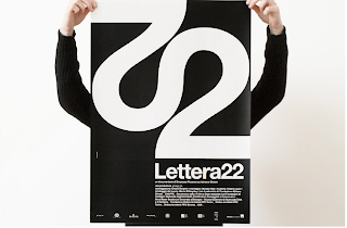
Lettera 22
Not quite sure what this project is for, but I'm guessing some form of event that it's promoting judging my the format of work displayed. I really like the type treatment of 22, which has become the identity throughout, something I would look into exploring for future projects myself. The rest of the materials demonstrate Artiva Design's attention to detail and consistent approach to layout and format, which I really like.
I've also just noticed that both pieces that I have chosen only use black & white, which just says how strong and powerful the use of type and layout can be even without the use of the colour.


No comments:
Post a Comment