Thursday 28 April 2011

Look book - Progress

Current stage of the look book so far.
Things to revise / amend:
- Adjust the inner margin of the back cover. Could possibly place type into this instead or pull the bars back so that it doesn't get exposed.
- Adjust the type and the label at the back of the slip case. This could be a sticker that could wrap around the slip case instead of being printed.
- Produce the final maps in high resolution.
- Edit all photographs that will be used and get them prepared for printing.
- Insert all correct copy.
- Make final adjustments to the layout of images and type in the spreads.
- Consider alternative bind?
- Get everything prepared and ready to print final lookbook by Tuesday.

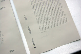
Printed letterheads

Test prints for some of the more interesting letterhead designs. Again I needed to get them printed out to check on the type specification and the readability of the information. 

Reprinted a couple of my personal favourites on a slightly coloured stock. Wasn't too sure about this but wanted to test it out anyway, and to be honest, they look pretty good (except for the wavy paper due to it being fed through the laser). 


Not sure myself which one to go for yet, it all depends how the designs transfer to the business cards and compliments slips and how it works with the look book.

Mockup 02

2nd mockup with a fully printed book, first initial spreads and a printed slip case. For whatever reason, the spreads inside have been printed out at a slightly smaller scale meaning that it doesn't quite reach the edge of the book. It's still gives a good enough idea of what it should look like anyway.

The mockup so far looks quite promising, both myself and Laura really like the direction that it's going so far. I think in general, we're almost there with the general design direction of the book, it flows well with the identity and branded materials that I'm also working on at the moment and seems to reflect the brand quite professionally with an interesting design approach. The only things to make adjustments to are mostly the stock considerations, layout adjustments and to revise and update all the copy and type throughout the whole book. There are also a few other ideas such as a pH collection sticker to apply onto the slip cover that I'd like to try out, this will be something that we'll have to consider while developing the rest of the materials.


An interesting detail on the back, which has been the result of not really measuring the specifications too precisely. 


The packaging and the front/back covers of the look book has been kept to black & white throughout, together we felt that this fits really well with the tone of the brand and the process of how the coloured images get's revealed when the book is opened. It also made the design of the cover a lot more professional and focused stripping out the colour, without compromising on delivery the desired effect. 


Introduction and concept explanation of the whole collection. This was written by Laura and have pretty much been used as inspiration and the drive for the design direction of the branding and the lookbook really. 

The look book is divided into 2 sections; the alkaline and the acid collection, I wanted to make a prominent divide between the two really as it helps clarify the nature and concept of the collection, therefore have made page breaks between the two labels. The breaks basically contain the opening introduction of each label. Again, re-introduced the map in the background so that the book and the slip case so that there is a more consistency between them.

A varying range of different layouts for each product. The client really likes the direction so far and was happy that each spread kind of had it's own layout to it. There's quite a bit of copy that comes with each product, therefore I needed to form a considered and functional layout that would allow for the text to sit comfortably with the images. 


Only two images have been used so far to showcase each product, I felt that this was the most comfortable number of images for the scale of the book. Anymore and it would either look too cluttered or inconsistent perhaps. I'm still not sure at the moment.


Credits for the lookbook, which still needs a bit of attention really. Haven't really played around with the type specification and the layout yet, so currently this feels very separate to the rest of the book. 

Back cover with the continued bars going across and the codes for each product. 

The smaller details of the slip case include printing in the inside of the case aswell, something that the user might not see until they return to it to put the book back it after, but still a small touch that I'd like to maintain. 

Mockup 01

I felt that I was at the point that I should start printing out the designs to check on the scale, type specification etc, and also to realise the format that I have chosen. I also needed to work out the rough thickness and size of the overall book so that I can start mocking up the slip case that it comes in. I wanted the measurements to be exact so that only the spine and the details of the lookbook are revealed. I think this slip case helps add something extra to the finish of the lookbook, eventhough it's actually quite a simple mechanism to protect the book.

So below here, I have just printed out the cover on a thin 130gsm matte and a rough slip case printed onto 80gsm. I just wanted to test the measurements of the case and how the book slots into it. I'm thinking of furthering the use of the maps and applying it onto the front of the case to contrast with the minimal design of the type treatment, layout and design direction of the book as a whole.


The horizontal bars work really well with the motion of pulling the book out, one of the details that I really like and would really like to refine a bit more either from the colours or the production side.


Tuesday 26 April 2011

Further spread developments

Spent some time together with Dave today developing a few more spreads and refining the finer details of the grid specifications so that we can push on with the final document. Together we've narrowed down 2 different grid specifications, so before deciding on which one we would use, we experimented with a few different layout variations using the 2 different grids, the 10 and 8 column.

Sunday 24 April 2011

Spreads Development

Developed some more spreads with a more considered approach to the type, layout and use of secondary imagery. I've reformatted the grid slightly, currently working on a 9 column grid with 2.5mm gutters, margins: 15mm x 10mm x 5mm x 10mm.


Alternative route with the same layout, the only different with this is that I applied a 20% black tint to the background, only because I felt that the layouts were a bit washed out from all the white, due to the nature of the photographs.


Fakery Revisited

So over the Easter break, I decided to dedicated a day or two on revisiting the Fakery brief, mainly because I wasn't too happy with the final execution of my idea. With the rush of getting it all completed for the ISTD deadline, I felt that what I had submitted seemed more of a final mockup rather than a final portfolio worthy piece.

I spent a long time working on the concept, the idea and the different methods of approach to get this brief nailed, and eventhough I'm not completely satisfied with what I have ended up with, I do feel that with a bit more time, I could make this a much stronger resolve to the brief.

Saturday 23 April 2011

Image treatment

The STUBBURBAN brand is all about durable outdoor menswear, this was something that myself and the client both want to reflect in the design of the lookbook itself, to try and move it away from a more conventional fashion lookbook appearance.

One of the ideas was to produce maps to use as part of the design direction, this could be applied as textures and almost background images to compliment the minimal approach of the type and layout.

(more text & images to follow)

Friday 22 April 2011

ISTD Feedback

Received our assessment feedback from ISTD yesterday and was glad to find out that I had passed and been award membership to ISTD!

The feedback on my design and typographic skills were generally quite positive, however I seemed to have lost most my marks on the fact that I didn't submit any research work or visual development material documenting my design process, which I was not aware I had to submit! When they said 'A2 portfolio' I'm guessing they meant a whole folio of development/research and final outcomes and not just 5 design boards which I had submitted!

I'm please with the results considering I had only submitted the minimal amount and didn't really provide development work to their submission requirements. As suggested by the feedback sheet, I will spare some time towards the end of this module to revise and develop this brief a bit further.

Further Development : Covers

A few more cover develops with a bit more consideration to the back aswell and how it works with the slip case packaging of the lookbook. The approach is to keep the design itself as minimal as possible whilst also incorporating some smaller details to compliment the simple design direction as a whole. I didn't want anything unnecessary that didn't fit in with the concept of the lookbook, but also aware that I shouldn't become too dull and boring.

Open publication - Free publishing - More development

A selection of some of the more interesting ones to develop if the client prefers them.


One of the first ideas for the back cover, this derived from one of my ideas of the front cover, which basically extends to the back, incorporating the codes for each garment.