This meeting was an point of contact for us to present and discuss the progress of the yearbook so far, in terms of the developed design direction. We had 3 different design routes to present in response to the previous discussion with the fine art committee. We produced 3 16 page mockups including front and back cover to demonstrate how the design directions are applied across the whole publication. Each mockup follows a similar direction with more minute adjustments, one of which are experimenting with 2 completely different typefaces, and the 3rd one was to show a more experimental layout approach.
Unfortunately, I was on placement today so wasn't able to make it to the studio for the meeting.
More text to follow***
Thursday, 31 March 2011
Cover Developments
With another brief meeting arranged for tomorrow with the fine art committee, we needed to develop some more covers or atleast refine what they had selected from the previous meeting. I was mainly responsible for working on the cover ideas for the previous few days so decided that it would probably be easiest for me to develop these.
Because I wasn't able to attend the previous meeting with the fine art committee, I had to rely on the rest of the group to tell me what they had selected and where we were at, to dictate how I should develop these. Sheila and majority of the committee really liked the use of the large type pushing out of the page and coming back in, they particularly appreciated the concept of how it was slightly difficult and confusing to read, stating that it reflected the whole idea of what they did.
These were the initial thoughts that I had to consider when making these revisions, I was informed that I should continue to experiment with the two different typefaces that I had used before; Akkurat-Bold and Quicksand, two very different typefaces with completely different weights, letterforms and characteristics. They liked the idea of type going out of the page and back in and the concept of engaging viewers by making it slightly distorted and difficult to read instantly.
Atelier Carvalho Bernau Design
An great selection of work from Atelier Carvalho Bernau Design, a design studio in the Netherlands whose practice mainly focuses on typography, layout and type design. I love the fact that they work mainly within the creative and cultural sectors, such as for artists, exhibitions and education as their work really demonstrates a creative edge that pushes the boundaries of the more conventional design you'd normally see in commercial work. Some of the work is very technical and clever in terms of the typographic treatment whereas other projects would be incredibly simple to the stage that they almost seem undesigned/natural.
Index of Cloudless Skies is a great example of this, partly thanks to their client who seems to allow them complete freedom to experiment and do whatever they want whilst providing them with the best content ever. The idea was to basically put found images of cloudless skies into a book format. The final design outcome might seem very simple, but it is the design process that I'm interested in for something like this. I think ATelier Carvalho Bernau Design would be another to get in contact with for my design context, a publication project like this would be so fun to work on!


Dear Reader
'A collection of obsessions, oblique references and footnotes of design processes — though not necessarily texts about design.
The layout is appropriately diverse and eclectic for the bandwidth of texts, layering different formats and texts, as a tongue-in-cheek reference to the design shtick of publications with different paper formats. Here we present three iconic formats in emphasized-as-fake three-dimensionality, on four different papers and more inks than you would think.
Dear Reader was created partly from a primordial graphic designers’ urge to publish something and to share texts that are dear to us, partly in celebration of our Atelier’s approximate fifth anniversary, and partly as a vessel to showcase our type design work in a manner that circumvents the conventions and the visual clichés of the type specimen'
Really love the format of this publication, creating a container within each spread to produce an insert effect.


3rd Meeting - Steve Edge
The meeting with Steve today was brief but generally very positive on the direction that we've been working on so far. He picked out a few that appealed to him but eventually chose one final one that he like the most and wanted us to develop further. He seemed to prefer the more minimal approach, which is interesting, also stating that he liked the bold colours we used eventhough he wanted an emphasis on sustainability.
Some initial ideas printed out to scale in full colour to present to Steve. These were the ones that we have selected out of the numerous developments we managed to work on so far. I think we've made a pretty strong start to this so far, having only spent a day actually working on the design aspect of it, we've produced some very interesting ideas that show great potential on where this could lead us.
A few key things that we have taken note of from this meeting are as follows:
- We will be going for the 36 page + cover specification.
- Experiment with the minimal approach as reflected from the cover idea that was chosen.
- Perhaps consider a 'what we like' spread to fill the 2 empty pages.
- Consider using a spot colour for cover & throughout the prospectus.
- 500 copies print run
- Consider multiple different stock choices if the budget allows.
- Maintain the minimal & bold cover
- Test out the use of vertical lines
- Mono/Duotoning images
- Colour pages
What needs doing between now and our next point of contact (Thursday 7th April):
- Look into printing costs and prices for spot colour/ stock etc.
- Experiment with the cover ideas
- Test out different typefaces
- Experiment with different colours
- Develop spreads / layout


The 4 that were selected as ones that he had the most. Perhaps we should consider incorporating certain elements of all these into the spreads.


This was the one that Steve chose as his favourite cover design and design direction. Generally quite minimal but very bold in terms of the colour. We are hoping to use a spot colour for this, might not neccesarily be red/orange but a spot colour that runs across the whole prospectus would a nice touch. With the print run, page numbers and budget, this could be something that we can consider so will have to look into this in terms of price. A neon Pantone 805 could be something to think about! Exciting!

Elephant Magazine
Picked a copy of Elephant magazine when I was in Berlin almost a year ago and found that certain elements of it were quite relevant to our design context towards the interior design prospectus in particular. These were mostly the use of rules within the spreads, a detail that we feel we could explore in terms of making the spreads more interesting while still relating to the subject of interior design. Also the treatment of type and image layout is quite nice here, utilising a decent margin throughout, plenty of white space and a good balance between type and image.


Article
Another nice publication that we took into the meeting to show Steve. This was mainly to reference the use of a fluorescent colour for the inside section of the magazine, which looks really interesting. This is something that we could consider for use within our book as it could potentially be within our print budget. Instead of having a print finish, the whole design direction of the book could be driven by the bold colours and minimal approach to the layout and type. It would stand out against other books whilst providing an engaging and interesting read.
The fluorescent colours have been used for a selection of this free magazine from Sheffield, perhaps due to the budget or possibly the dynamics and flow of the publication, it was only used for a few few spreads. This made the magazine a little bit more interesting as there was a completely different direction and layout treatment to it, ultimately giving itself it's own section within the magazine. This is similar to something that we've discussed about possibly separating the showcase spreads and the rest of the book by the use of colour or stock.


The fluorescent colours have been used for a selection of this free magazine from Sheffield, perhaps due to the budget or possibly the dynamics and flow of the publication, it was only used for a few few spreads. This made the magazine a little bit more interesting as there was a completely different direction and layout treatment to it, ultimately giving itself it's own section within the magazine. This is similar to something that we've discussed about possibly separating the showcase spreads and the rest of the book by the use of colour or stock.


Quotation Magazine
Quotation is a Japanese creative journal that talks about anything creative pretty much, from fashion, lifestyle to graphic design. Although it's mostly in Chinese, I can still appreciate the typographic considerations and attention to detail towards the design direction.
We took this to show Steve aswell, highlighting the key elements of it that we like and feel could be considered for the interior design prospectus.These include the sublte type treatments, page numbers and layout specifications for a publication that's almost the same width as our book.


We took this to show Steve aswell, highlighting the key elements of it that we like and feel could be considered for the interior design prospectus.These include the sublte type treatments, page numbers and layout specifications for a publication that's almost the same width as our book.


3rd Meeting - Page order/specification
We've laid out 2 specifications for the book order and page numbering, one for a low budget and a slightly higher budget with more relaxed flow of pages and more space to experiment with.
24 page specification:
 36 page specification:


24 page specification:


3rd Meeting - Cover/ Design Direction ideas
Developed and prepared some work to present to Steve today for the Interior Design prospectus. Me and Dave both worked on our own cover and design direction ideas individually before meeting up a couple of hours before the meeting to run through what we've got, refine a few of our strongest ideas and get something printed out.
We focused mainly on the covers first as we felt that this would determine the direction of the spreads inside, aswell as the typeface choices, colour and print specifications. Here's what we presented for covers:
The ones I develop were quite minimal in comparison to the ones Dave did, working on a range of different ideas based around the theme of interior design. We picked these together out of all the ones that we had developed as they show a breadth of the different ideas we had, hoping that he'd highlight elements of different ones that he likes, or possibly, pick out one that he really liked. That would be ideal.


 These are the ones Dave worked on and presented to Steve, his designs utilised the images that Steve provided, playing with shapes, colours and both use of typography. Again, we selected these for the range of different design directions that they demonstrate.


We focused mainly on the covers first as we felt that this would determine the direction of the spreads inside, aswell as the typeface choices, colour and print specifications. Here's what we presented for covers:
The ones I develop were quite minimal in comparison to the ones Dave did, working on a range of different ideas based around the theme of interior design. We picked these together out of all the ones that we had developed as they show a breadth of the different ideas we had, hoping that he'd highlight elements of different ones that he likes, or possibly, pick out one that he really liked. That would be ideal.


Wednesday, 30 March 2011
Initial cover/ design direction ideas
Some first ideas on covers and general design direction that we could possibly experiment with for the rest of the publication. Kept everything quite simple for the time being, with little change to the typeface, I focused mainly on the application of type, layout and arrangement of image elements, which would inform the direction of the whole prospective.
Several different ideas were developed quite quickly with a variation of different ones between them. The first idea takes inspiration from the publications that Steve mentioned such as Frame and Blueprint, these both have a well finished quality to it in terms of the production. Design wise, the typographic treatments are well considered, with varying title/ heading typeface choices, which compliment the clean layout of text. As a visual magazine focusing on interior and architecture, they both contain plenty of images mostly in full colour and sometimes in a duotone/monotone for added dimension.
My first two set of ideas basically incorporate these qualities into one, working on a square format. There isn't much text to place for the front cover as far as Im concerned so most of it was taken up by large images of work/ photos that relate to the practice with the title of the prospective, institute details and relevant years included. To start off with, I worked with simple layouts and made minor adjustments, experimenting with the arrangement of type, scale, hierarchy of type etc, whilst considering how this would transfer onto the spreads.
Whilst my earlier ideas were strongly influenced by the type of publications that Steve referenced, I wanted to move away from it a bit more as it often looked more like a magazine rather than a yearbook. I needed to consider that we probably won't have so much of the high quality images that these magazines had to play with, so we could potentially explore a route where we would produce new imagery that relates to the course. One of our earlier ideas that has been discussed was to embed wireframe / incomplete draft illustrations and renderings into the spreads, and using that wireframe quality to act as a design direction.
These developments basically demonstrate the idea of trying to create an identity/design approach that is inspired by wireframe drawing that you would often see within the interior design process. I played around with patterns and shapes quite briefly, which I quite enjoy; they seem quite daring and experimental, only issue is that I'm not sure if they deliver the correct tone for the prospectus.
Going back to layouts with images of student work, both development and final outcomes.
Open publication - Free publishing - More covers
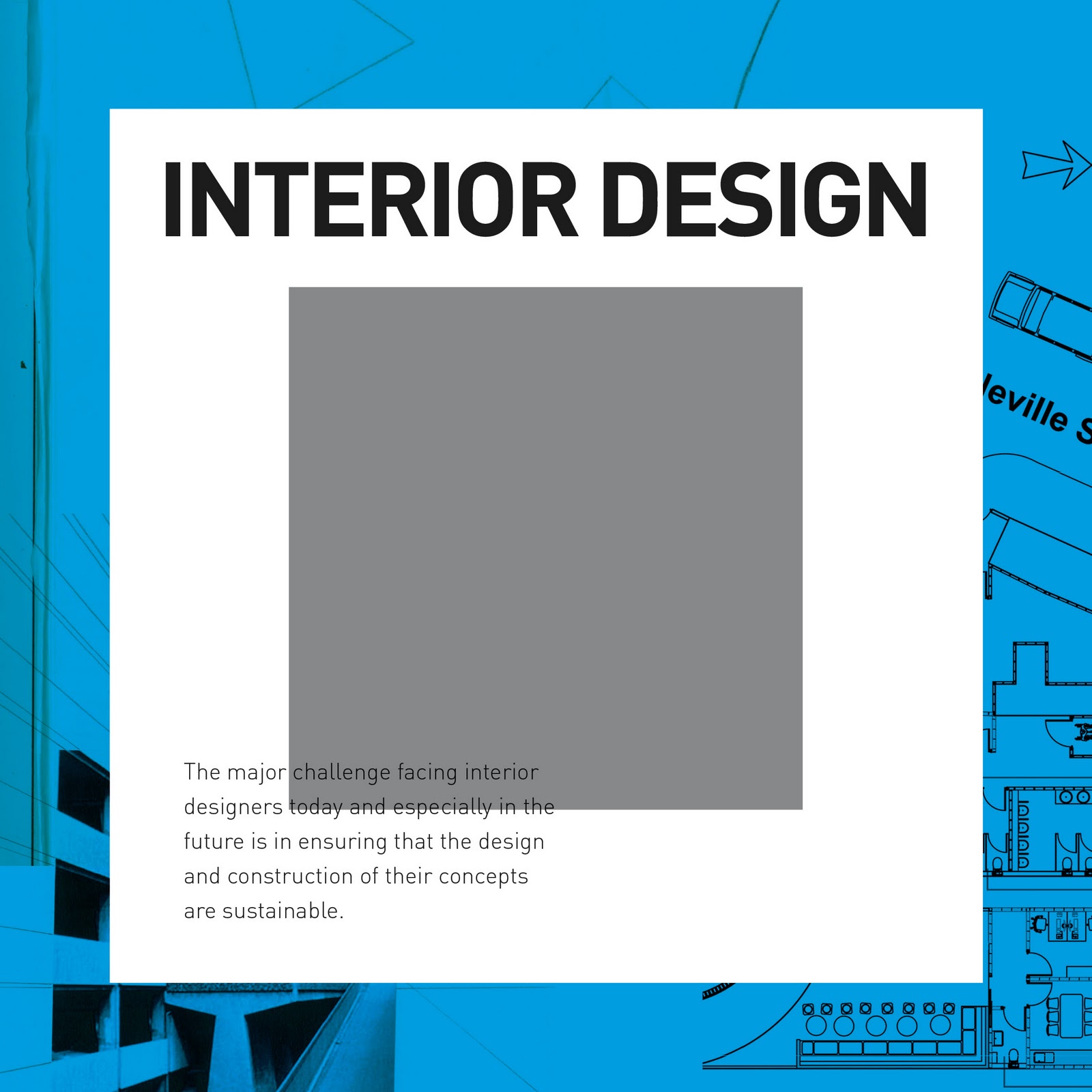
The last batch of developments I worked on was basically an idea and direction that would allow me to push the boundaries and layout of a square format book so it looks more interesting and dynamic. This white box would allow for the type to sit comfortably on, without being distracted by the imagery at the back. This method could be used in the spreads aswell, to separate the type and images.
I do really like this direction personally, there are plenty of things we could alter with this, but in terms of design and personal preference, I think these last few are a lot more exciting and flexible to work with than previous ones possibly.


Subscribe to:
Comments (Atom)