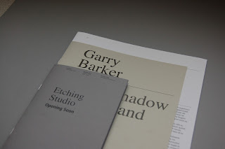
With little time left to work on this, I was only able to make a few spreads of the exhibition guide and a separate booklet for the etching studio. I wasnted to develop several other ranges for this, but wasn't able to due to the lack of time that I had left myself to work on this. I am quite pleased with the mock up though, the quality of the prints turned out really well, the colours chosen and tactile quality of the various stocks work well together. The identity is carries across all materials through the consistent type treatments and layout specification.
I limited the use of colour throughout, keeping it quite monotone, while only introducing elements of colour and tone with the stocks and for the work that's showcased. I would have liked to be able to develop a few more spreads for this really, so that the booklet overall has a more realistic number of pages, which alters the feel of the publication altogether.


No comments:
Post a Comment