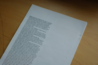
First print outs and mockups to test scale and to make a decision on which typeface to use for the copy. The scale of the publication feels really to nice, it's a slightly smaller version of an A4 sheet, and without the pages being folded for the bind, the spine feels really loose and light to hold, altogether adding to the interesting feel of the publication.
I wanted this to contain an almost manual-like feel to it, to contrast against the high volume of colour and content of the calendars, this publication was to be used as a reference book, therefore the emphasis was on the clarity of it, therefore stripped it down of any colour.
After experimenting with 2 sans serifs : Helvetica and DINpro and 2 serifs: Baskerville and Times New Roman, I felt that DINpro worked best for this, the serifs were probably the best for readability in this context but DINpro was used throughout the calendars and it felt to the most suitable one to use. This is something that will confirm itself as I develop this I think so will just work on DINpro for now and see where it goes from here.


No comments:
Post a Comment