Saturday, 29 January 2011
Friday, 28 January 2011
Team Meeting
Team Assembled
I didn't really have anyone in mind who I wanted to work with on this, from past experience I felt that a pair or a 3 worked the best for my design practice, so really wanted no more than 3 people to collaborate with. I'm fairly confident with working as a team as past collaborations were quite successful and didn't really have a particular 'style' to go with for the year book, so when choosing design partners/team I didn't really pick people for their design attributes, but rather how well we would work together as a team.
Luckily I was asked by Liam to collaborate and I was more than happy to accept the offer, we ended up joining forces with Vickie & Ed who were in a pair already, although this did go against my previous opinion on working with no more than a group of 3, I felt that we all had something to contribute and all wanted to work on the Graphic Design year book, yet no one had a particular style that they wanted to work on, so it was perfect for developing a fresh concept for this, which is what's going to win us the pitch.
Problem analysis
We had a brief meeting today to discuss initial thoughts on what we wanted to achieve and produce for this yearbook. My idea was that I really wanted to move away from the whole Yearbook 'look' and produce something that's a lot more professional with high production quality while pushing the design boundaries of what a yearbook could/should be. Considering the budget of £2500 for the production, one of my ideas was to keep the spreads single colour, everyone was against the idea really as it wouldn't be be justified reason as it was to displayed student's work, however I felt that the yearbook would be used to showcase and offer a taster of people's work rather than providing the whole portfolio work. Therefore felt that it could be a possibility. In the end, we decided that we wouldn't be going forward with the black & white idea because it would be too risky and possibly won't be picked for this reason. Other than this, we all shared some pretty exciting ideas for format, folding techniques, binding formats, stock considerations and finishes, but it eventually dawned on us that the budget would be the major issue for these ideas so needed to really focus on the concept first before we start making decisions on the design aspect.
We struggled for a while to get a solid concept, we all shared several key aspects that we wanted however, these were: it needed to look professional and not as a student year book, representing reach student as designers and not graduates aswell as individuals.We didn't really want to have a particular theme to cover the whole yearbook such as: nostalgia, the beginning etc as we found that these were quite obvious and way too boring, which don't even represent the course and the indvidual students. This lead discovering the fact that we had 44 students, therefore wanted to use this as the concept. Rather than having a yearbook to showcase graduate work, we wanted to produce a publication that celebrates 44 individual designers from the college. We didn't want to produce something that would only function from the exhibition and a few months after, but something that would almost become a creative directory for designers, that would be used for several years to come.
For the design element, we started by dissecting and analysing the previous yearbooks and picked out elements we liked and didn't like to help inform out decisions towards the design direction. We felt that both designs were relatively safe and at times made it quite boring to flick through, therefore for this we wanted to experiment with a more diverse layout specification. We wanted an interesting contemporary design direction for our yearbook which didn't shout yearbook, but a creative directory of 44 fresh designers.
Thursday, 27 January 2011
Yearbook pitch
Yearbook for the BA (Hons) Graphic Design 2011 graduating students. I wanted to work on this brief because it would allow be to work collaboratively, project manage, work on a publication and oversee the whole production aspect of the project. The content was quite fixed so I didn't have to spend so much time researching for the content, which I've been quite used to doing up until now, therefore leaving more time to work on the creative side of things.
I had quite a few initial ideas in mind for this so was eager to make a start, the fact that it was a pitch made it a bit more exciting to work on aswell so I was quite excited to work on this.
I had quite a few initial ideas in mind for this so was eager to make a start, the fact that it was a pitch made it a bit more exciting to work on aswell so I was quite excited to work on this.
Wednesday, 26 January 2011
Keller Maurer Design
Publication, identity and design guidelines for Munich Re by Keller Maurer who are a Munich based design studio focusing on 'Corporate design, Corporate and financial literature, Book and catalogue design, Signage systems and exhibitions, Web and interactive design, Creative and strategic design direction'
A really nice piece that is supported by a good balance of form and function.
Self promotional piece for Keller Maurer Design, great way of promotion in a printed poster format, showing thumbnails of work giving potential clients a taster of what their work is about. The use of 2 colours gives this unity and refined design. Would be interesting to know what the size and print specification for this is though.
Tuesday, 25 January 2011
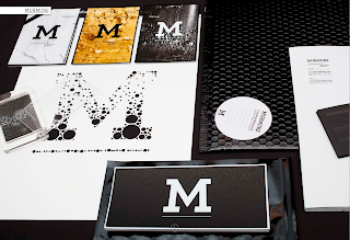
Murmure
This identity and promotional material for Mumure by Mumere is rather nice. They are a design studio from France with an emphasis on type and effective communication. Their execution of work is fantastic and to a very high standard, utilising some amazing print finishes.
Definitely getting some ideas for when it comes to developing my own promotional and identity, which isn't a long way away!
Another business card they did, but using spot varnishing for the type and the whole card seems to be heat sensitive, which is rather impressive. Also really like that glass card frame/case! Almost like framing a business card!
Made Thought
Particularly love this publication for Future Laboratory designed by MadeThought. The design direction from the cover to the spreads inside work really well, demonstrating a well considered format, layout and a good balance between the type and image. Something that I've always found myself to struggle with still.
I have noted this before but I'm beginning to prefer this format of displaying work as opposed to the infinite background. I feel that this format although it is only a suble difference gives the pieces more of a functional feel, it doesn't look like it's being exhibited like a piece of art as much. Also it allows the products to lean on them, allowing for better angles when photographing it. Will give this a go when I reshoot everything for my website again.
I have noted this before but I'm beginning to prefer this format of displaying work as opposed to the infinite background. I feel that this format although it is only a suble difference gives the pieces more of a functional feel, it doesn't look like it's being exhibited like a piece of art as much. Also it allows the products to lean on them, allowing for better angles when photographing it. Will give this a go when I reshoot everything for my website again.
Wednesday, 19 January 2011
Pronomade(s)
Not very relevant to my practice or my work really, but this series by Helmo titled Pronomade(s) drew my attention straight away. Not quite sure what it's about to start with but I was definitely curious, I guess it did it's job by getting people's attention! It turns out that these images are part of a series of design materials that cross over into posters and a publication for an event.
I find these images quite creepy but also very intriguing. That's all.
The rest of the project can be found here
I find these images quite creepy but also very intriguing. That's all.
The rest of the project can be found here
Three60
A slight contrast from the previous posts, but as I'm looking to be designing the brand and look book for a fashion student's end of year show, I thought i'd start looking into more specific fields of graphic design for the fashion industry. What better place to start than Australian based design agency Three60 and their work for fashion based clients.
Life with Bird
Interesting concept of using tubes to host the promotional materials. The work has evidently been well thought out and attention to detail such as the stock and printing finishes have been a core aspect to their design development.
Series of promotional work for Claude Maus
More on this very soon!
Artiva Design
A recently discovered design studio that I have not heard of or seen any work from before. Artiva Design is an Italy based design studio formed out of Daniele De Batté and Davide Sossi. They are another studio that designs predominantly with type, layout and clarity as it's main focus, working with a range of self initiated, cultural and commercial sectors.
Clean & Clean
Not entirely sure what this project is about but it does to be a brand identity and brand guidelines booklet for Clean & Clean. The simple approach is interesting and works with the name, but I feel that it's lacking some more information with the specifications, maybe this was intentional, maybe not. Either way, I still like it and it's kind of given me an idea on some of my own briefs. I've been meaning to develop a brief that would allow be to produce some sort of brand guidelines whether it is for a company, organisation or guidelines for a publication. This has definitely given me something to think about.
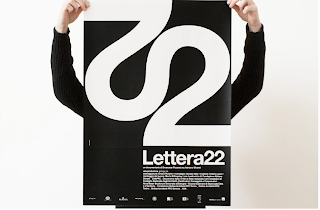
Lettera 22
Not quite sure what this project is for, but I'm guessing some form of event that it's promoting judging my the format of work displayed. I really like the type treatment of 22, which has become the identity throughout, something I would look into exploring for future projects myself. The rest of the materials demonstrate Artiva Design's attention to detail and consistent approach to layout and format, which I really like.
I've also just noticed that both pieces that I have chosen only use black & white, which just says how strong and powerful the use of type and layout can be even without the use of the colour.
Subscribe to:
Comments (Atom)


