This module has been a massive learning and development process; it has challenged my design practice, theoretical understanding, and ability to work with other people towards improving my skills in general to becoming a better graphic designer. From my original rationale, I had set out to challenge myself and work on a wider range of briefs whether they are live or not; I just wanted to work on a variety of different projects that would allow be to develop the way I work and to clarify what I would like to do after the course. Ultimately I wanted to experience a range of different projects and to really push my ability to manage several projects at the same time of different requirements and to be able to deliver high standard and effective design solutions.
My main focus for this module was to develop a strong range of portfolio pieces that reflects my practice and what I’m a bout as a designer whilst improving the way I work independently and with other people. I tried not to be too selective about the types of briefs I wanted to work on as I believe that any brief can be made interesting; it just depends how you read the brief and what you do with it that makes it different. The 1st one being a collaborative brief for the Fine Art yearbook, this was relavent to my practice as it was a collaboration and that it was a publication brief that had a client to supply the content to. This brief along with the other 2 collaborations with David Gasi and Ross Stanton has made me realise that I am able to work quite efficiently and effectively with other people and towards a live brief where there is a client on the other end to response and to meet the standards of. Within a team, I see myself as working as a designer’s position in a way that I seem to be able to easily produce or negotiate ideas and develop them within a group where it is often much more difficult to make your opinions heard, this has reinforced my initial thoughts on working within a small scaled design studios. Although I prefer the idea of working independently as it offers me the full freedom of designing what I believe is the right answer, I really appreciate the benefits of working as a team and enjoy the collaborative practice, my ability to work with other people and to have an influence on how the project develops has justified my ability as a designer.
During this module, the majority of my briefs were either live or competition briefs, again I struggled with making a decision on which brief so ended up just taking up any that came across and were relevant and appropriate to my original rationale. The branding and promotional materials for Laura Stubbs, was a brief that I had originally planned to spend a week on, but escalated into one of my main briefs. Although in my rationale, I had planned to focus on working on and developing my design skills towards publication designs, most the time wasn’t actually spent on the publication. Infact the part I enjoyed about this was the branding and defining the design direction and brand guidelines that would fit across the range of materials. As it was a live brief, I worked quite closely with the client to discuss ideas and to define what her brand is about, which dictated my decisions. The final results for this brief although did not have a huge range of materials, is one of my most consistent projects to date. The majority of the time was spent trying to nail the design direction, the specification with the typography, colour scheme and design direction. This is something that I have not had so much focus on before, the emphasis on consistency and awareness of developing a much more rounded and refined outcome as opposed to just having an aesthetically driven outcome is something that I feel is defining my practice a lot more.
My strengths seem to lie within the contextual awareness and ability to develop work to answer a brief that is driven by the core value and message of what the brief or the client asks for, whilst being technically and theoretically experienced to execute an idea to a good standard. This probably explains my initial obsession with research driven briefs, as I seem to enjoy the process of gathering information and developing a response to that based on the content. This is probably evident in most of the briefs I have worked on throughout this module, but primarily the Stubburban brief, design context and the yearbooks are the ones I feel have a grounded concept and execution to it. In comparison I struggled a lot more trying to work on the ISTD Fakery brief, eventhough it was a competition with a written brief and defined specification requirements etc, there wasn’t a client or a particular functional objective to respond to.
I wasted a lot of time at the beginning of this module trying to resolve the Fakery brief, I found it difficult, as it was purely conceptual and was a completely open brief. Ironically I chose to work on that brief because of that reason but through experimenting and working on the brief, it has made me realise that my way or working is a lot more suited to a more conventional studio practice where there is a designer – client relationship. On certain projects, I failed to push the development and the range that the briefs had the potential to, this was party due to my practice of not fully experimenting before making a design decision and also the issue with timetabling myself unrealistic schedules as usual. Looking back at a few of the briefs, I definitely feel that a lot more change and developing more range could have been made, but on a realistic industry situation, I would have possibly done a similar thing as I feel that I only made the decision based on whether I felt further development work was required towards answering the brief.
Referring back to my rationale and the course of the past 3 years, I feel that I have fulfilled the majority of what I have set out to do, mainly developing my design practice, work on a range of projects independently and collaboratively, and having some sort of focus on publication design with a specialist in the use of typography. The main thing as mentioned earlier is my design practice; I definitely feel that I am working to a more professional level, being able to fulfil the brief and meet deadlines whilst also producing interesting work that considers the use of type/image, production specification and limitations and ultimate what the client wants, which this course has taught me. Based on the amount of time I have spent on this module, I am quite satisfied with what I have produced, I am aware that they’re aren’t perfect and improvements can be made, but more importantly the time that I have spent on this module has helped shape who I have become as a designer. I definitely feel a lot more prepared for tackling the real world and have a greater sense of where and how I would go upon taking my first steps into the professional industry.
Friday, 3 June 2011

Thursday, 2 June 2011
Final design context publication
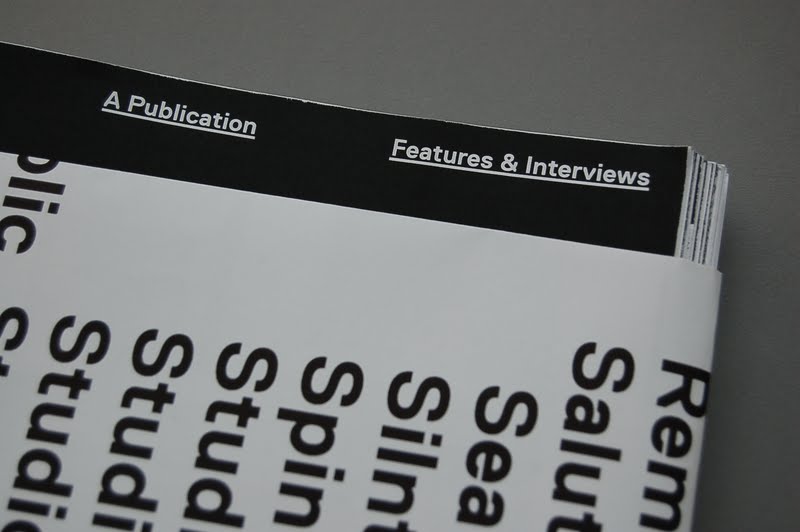
Final printed design context publication. This will be packaged in a metallic black bubble wrap envelope to be send off to the contributors and for hand in ofcourse.


The publication itself will have a wrap around on it, which will have a selection of 1 picture for every project that it featured in full colour.


On the reversed side of the poster, there is a complete list of all the featured studios and contributors to the publication set in LL Replica.


The publication itself will have a wrap around on it, which will have a selection of 1 picture for every project that it featured in full colour.


On the reversed side of the poster, there is a complete list of all the featured studios and contributors to the publication set in LL Replica.


Monday, 30 May 2011
Final wrap around
The final designs for the wrap around for the design context publication. This will be printed duplex on the light 130gsm matte stock, but ideally something even lighter but will have to see what I can source in the limited amount of time I have left!
Still can't decide which one to go for, for the type side of the poster. I really do like the rules running across the whole design which actually clarified the design and the order of reading, especially with the indented names. However this feature apart from in some of the unerlined headers, doesn't really appear anywhere else in the context publication, so I'm just wary over the consistency of it. The other thing is also the colour, I felt that black on white is a bit too cold and dry as it run throughout the publication, so currently stuck on a dilemma with this decision.


One thing that has been decided however is the final layout for side A, the side which will be visible when wrapped around the publication itself. Further developing from the previous versions, I have adjusted each image to their ideal resolution and overall composition, individually and as a whole set. I've also distributed all the interview ones evenly throughout the arrangment. In comparison to the previous printed mockup, the images are alot more organised as they are all aligned to the type and snapped to a row of 9 grid set to a 5mm margin.
Just hope I can get couple of copies of this printed before deadline to go with the printed publication which should arrive from Lulu very soon!

Wrap around - side B development
As mentioned on the previous post, the list of design studios will now be featured on side B of the poster, the side which will be hidden from view and only be visible when the user unfolds the wrap around.
More to follow


More to follow


Wrap around - side A development
Since getting the 1st mock up printed out, I decided to have the image side on the outside instead. I felt that this route would allow the images to compliment the minimal design direction of the front cover for the publication itself. It also makes it more obvious that there are coloured images printed for the poster with the overall finish looking a lot more dynamic that simply just type.
Content wise, I'm am now going to showcase 1 image for each featured project in the book, as I have featured 54 design individuals and design studios altogether including the interviews, I have 54 images to select.
Here are some further developed designs for the covers. I started off by placing black squares in to get an idea of how much space I would get, this would ultimately dictate the size of the images as I'll have to fit 54 images onto one side.


LAST WEEK - PLAN
Last week until final deadline! I need a plan so here is a list of what needs to be done from now till Friday. Most of it will be all the admin and putting stuff together, not really in a stage to be doing much development work on final projects really
General stuff
- Collect and file all progress crits, time tables and all admin stuff into a progress file.
- File all emails and admin related stuff
- Update all tags on blog
- Make sure blog is up to date
PPD
- Branded materials; letterhead, compliment slips, business cards
- Update website
- Studio Co-Lab details to blog, k
- Portfolio
Design Context
- Ensure that blog is completely up to date
- Printed publication + wrap around packaging/poster
- Branded packaging envelope
Laura Stubbs
- Bind final lookbook
- Finish range of materials; website + other printed materials
- Design boards
Fakery
- Design boards
- Re-print final booklet
Yearbook
- Ensure that blog is completely up to date
- Design boards
EOYS Pitch
- Blog
- Design boards
- Complete other proposed range of materials. (Signage)
Interior Design
- Sign off to print
- Complete the rest of the range
- Blog
- Design boards
Garry Barker
- Design boards
Editions of 24hrs
- Design Boards
- Possible range?
Prospectus pitch
- Blog
- Design boards
Friday, 27 May 2011
Interior design invite development
Dave and I spent some part of today further expanding the interior design publication brief. Along with the promotional posters, we decided that the publication could potentially be posted out to prospective students for example. Therefore to accompany the publication we decided to develop an invite that would carry the same design direction that we have developed so far.
The invite functions as a wrap around for the publication, providing exhibition dates and times. Together these will go into a translucent envelope and be sent out to people. We wanted something that would be consistent with the rest of the publication, therefore using the same design format and guidelines that we had defined earlier such as the fluorescent colour, rules and typographic specification.
The design is quite minimal and in keeping with the rest of the designs we have done for this brief, the tag line is bold, direct and has a strong impact, with the smaller details printed on the back of it.


Document sent for print
After several revisions and proof reads of the publication, I have finally sent the document over to Lulu to get printed hopefully by Thursday.
Cover front/ back

Cover front/ back

Design context - details
Close up shots of some of the typographic details that run throughout the publication.


Mockup 02 - Printed wrap around poster
Printed the 2nd mockup of the design context publication today, but also mocked up a quick wrap around/poster for the book itself. So far up until this point, I have been focusing on the publication itself as there was a deadline to get this sent off to Lulu so that it get's back in time for the hand in, so haven't really had the time to realise the wrap around design.
I mocked this one up quite quickly simply to test the format of it and how it functions with the design, size and format of the publication itself. The 1st side which will act as part of the front/back cover of the publication will have a list of all the featured designers and design studios, following on from the format of the front cover itself. I liked this idea as it acts as a contents page and delivers message quite clearly. The whole thing however needs a lot more development ofcourse, the type needs to be reconsidered and refined, and the images on the other side need to be categorised, ordered or referenced in some way so so it ties in with the publication a bit more.
For a quick mockup, it functions well, but the folding method needs a bit more thought, especially where it will fold around the spine of the book. I'm still unsure on having a full list of the features as this repeats what's on the front cover of the book itself, also one of the studio name's will eventually land on the spine, which I don't want.


The way the fold opens up to reveal the images is interesting. I touch myself at night


The cover folds out to reveal images of all the featured projects in full colour, this will make up for the black & white images throughout the publication itself. The layout of it this at it's very early stages, I havent' made much consideration to it but it's a start.


I mocked this one up quite quickly simply to test the format of it and how it functions with the design, size and format of the publication itself. The 1st side which will act as part of the front/back cover of the publication will have a list of all the featured designers and design studios, following on from the format of the front cover itself. I liked this idea as it acts as a contents page and delivers message quite clearly. The whole thing however needs a lot more development ofcourse, the type needs to be reconsidered and refined, and the images on the other side need to be categorised, ordered or referenced in some way so so it ties in with the publication a bit more.
For a quick mockup, it functions well, but the folding method needs a bit more thought, especially where it will fold around the spine of the book. I'm still unsure on having a full list of the features as this repeats what's on the front cover of the book itself, also one of the studio name's will eventually land on the spine, which I don't want.



The way the fold opens up to reveal the images is interesting. I touch myself at night


The cover folds out to reveal images of all the featured projects in full colour, this will make up for the black & white images throughout the publication itself. The layout of it this at it's very early stages, I havent' made much consideration to it but it's a start.


Subscribe to:
Posts (Atom)