Open publication - Free publishing
Showing posts with label Brief 06 : EOYS Pitch. Show all posts
Showing posts with label Brief 06 : EOYS Pitch. Show all posts
Thursday, 2 June 2011

Monday, 9 May 2011
Revised EOYS materials

Spent an afternoon today with Ross making the final adjustments and printing the revised version of our leaflet/poster along with some promotional posters for the End of Year Show, which we had originally pitched for. Our revised direction involved printing the type and the arrows of the poster side completely in metallic silver, so screenprinting was the way to go with this. Due to the print room being so busy even for drop ins, we were only able to get one digital copy
1st attempt to screenprint metallic silver. These first attempts didn't quite work as well as we had wanted, possibly due to the imbalance of the binder and metallic silver power the ink just wasn't applied to the paper properly. The print was very inconsistent and varied a lot, with later prints getting even worse. One of our arrow's got printed to the quality that we had wanted, which proved that the mixture of binder and powder was still viable, however the screen might have simply dried out too quickly, so after several attempts of this printing onto various stocks, we decided to wash the screen and try from the beginning again.


One of our arrow's got printed to the quality that we had wanted, which proved that the mixture of binder and powder was still viable, but possibly needed a minor tweak.


3 adjustments and attempts later, we achieved a much better result. Between this and the first attempts, we've amended the mixture several times, added a bit more binder and worked a lot quicker to ensure that the screen doesn't dry out too quickly causing it to block up. The results of these are pretty spot on, the metallic result looks pretty sharp, particularly on the black stock. All the type is nice and crisps without much loss of quality.

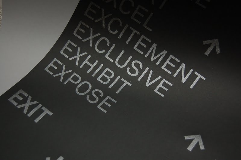


After a few more attempts, we got the final one overprinted onto the digital print. The result is pretty good, didn't work aswell as the other stocks we had printed but still achieve similar effect. Definitely to a decent standard.


Further extended our range of materials by simply printing these design onto a range of different coloured stocks, this could potentially be used as further promotional materials.


Saturday, 7 May 2011
Revised End of Year Show
Ross and I decided to spent a couple of days revising and reprinting the end of year show design materials that we had used for the pitch. We both really liked what we had done with the concept, considering the little time we had spent on it, so felt that it deserved a bit more time on adjusting to make it a potential portfolio piece. Looking back at it now, we're still quite happy to push the concept that originally had, we felt that it responded to the brief in an interesting way which said something about the college as a leading independent art institute. The issue we both agreed on that might have lead to it not being chosen could possibly be the design approach, firstly the choice of using black & white as our main colours probably didn't fit the tone and approach that the college wanted. And secondly the photography probably seemed a bit too 'hospital'.
In response to this and the feedback we had received in the crit a couple of days ago, we have made a few considered but minor adjustments to the type and layout of the leaflet side. We've also photographed all the photos ourselves this time as opposed to the previous ones, where they were just taken from the web as an image that communicated what we wanted for the sake of the pitch. The images actually suit the design a lot more, previously they looked quite clinical and didn't really fit the tone of the design, a problem which I feel the new images have amended. We've also spent a bit more time adjusting all the measurements of the images, layout and tracking/kerning/leading of all the type on it so it's a lot more precise.
Finally the main change was the decision to make the type on the poster side metallic silver, we feel that this would work well with the design and add an extra touch to the finish. Something that we'll have to test out and see if it really works in practice.
Here are the revised designs, front and back before the leaflet is folded.


Documents that will be printed; poster side which will be printed digitally.

Screen printed metallic silver over the poster side of the leaflet.

In response to this and the feedback we had received in the crit a couple of days ago, we have made a few considered but minor adjustments to the type and layout of the leaflet side. We've also photographed all the photos ourselves this time as opposed to the previous ones, where they were just taken from the web as an image that communicated what we wanted for the sake of the pitch. The images actually suit the design a lot more, previously they looked quite clinical and didn't really fit the tone of the design, a problem which I feel the new images have amended. We've also spent a bit more time adjusting all the measurements of the images, layout and tracking/kerning/leading of all the type on it so it's a lot more precise.
Finally the main change was the decision to make the type on the poster side metallic silver, we feel that this would work well with the design and add an extra touch to the finish. Something that we'll have to test out and see if it really works in practice.
Here are the revised designs, front and back before the leaflet is folded.


Documents that will be printed; poster side which will be printed digitally.

Screen printed metallic silver over the poster side of the leaflet.

Tuesday, 29 March 2011
4th Meeting - Fine Art
Another brief meeting with the fine art committee to discuss our progression with the yearbook. Unfortunately I was on placement at Qubik today so was not able to attend.
***more text to follow***
***more text to follow***
Saturday, 19 March 2011
Friday, 18 March 2011


Finals for print
Final developed layouts and design direction for the leaflets ready to print. We couldn't really decide which one we preferred, so ended up producing a black and a white version to compare when it's printed out.
Final concept:
Exit - to celebrate the journeys, process and work of Leeds College of Art students as they Exit into the real world, forming their own paths and shaping the industry.
Final concept:
Exit - to celebrate the journeys, process and work of Leeds College of Art students as they Exit into the real world, forming their own paths and shaping the industry.
Leaflet development
Leaflet development, which goes on the reverse side of the poster. This would include information about the exhibitions, times, dates etc aswell as providing some information about the college and the courses available.
We started off developing these in black as the main colour, but felt that it seemed to design orientated again and wouldn't really fit with the college's other branding materials. This would be a risk and does look quite bold but wasn't worth the risk in terms of presenting for a pitch; they'd either love it or hate it.
We started off developing these in black as the main colour, but felt that it seemed to design orientated again and wouldn't really fit with the college's other branding materials. This would be a risk and does look quite bold but wasn't worth the risk in terms of presenting for a pitch; they'd either love it or hate it.
Thursday, 17 March 2011
Development
While I've been working on the more minimal design approach, Ross came up with some pretty interesting ideas that incorporated portrait photography to show the diversity of students and relating back to people's journeys through the course and entering the industry.
End of year development
We worked on a range of different design directions to see which ones we felt could be pushed further. Things that we needed to consider when designing for a pitch was the tone, communicating the message, design approach and most importantly reflecting the college's values and reputation. We didn't want to commit to a single design as of yet, so decided to assign different design routes for each of us.
I was responsible for developing some ideas that incorporate simple icons such as the use of the X symbol and the arrows. We were afraid that it might look too 'designed' that only appealed to graphic designers, so Ross also developed a separate route that incorporated portraits of people aswell.
Development of the poster side and design direction for the end of year leaflets that fold out. This would be the fold out side of the poster with the design elements being transferred to the other side containing exhibition details.
Further development of a slightly different direction that derived from the concept of Exit. Arrows have been incorporated as part of concept showing the journey, process and direction that people would be leaving to - reflecting the aspiration, future and potential of the students of Leeds College of Art.
As much as I like these personally, they do seem very graphic design orientated and most likely won't appeal to the general target audience for the end of year shows that the college is targetting. Visually it's quite bold but doesn't really seem to fit in with the tone of the college.
I was responsible for developing some ideas that incorporate simple icons such as the use of the X symbol and the arrows. We were afraid that it might look too 'designed' that only appealed to graphic designers, so Ross also developed a separate route that incorporated portraits of people aswell.
Development of the poster side and design direction for the end of year leaflets that fold out. This would be the fold out side of the poster with the design elements being transferred to the other side containing exhibition details.
Further development of a slightly different direction that derived from the concept of Exit. Arrows have been incorporated as part of concept showing the journey, process and direction that people would be leaving to - reflecting the aspiration, future and potential of the students of Leeds College of Art.
As much as I like these personally, they do seem very graphic design orientated and most likely won't appeal to the general target audience for the end of year shows that the college is targetting. Visually it's quite bold but doesn't really seem to fit in with the tone of the college.
Wednesday, 16 March 2011
Concept development
Some quick ideas on the identity and concept based around the idea of Exit and 'This is it'


Tuesday, 15 March 2011
Collaboration : Ross Stanton
Ross and I have worked together before in a collaboration which went really well and we share similar interests and skills within design which allows us to work quite proficiently together, so we have decided to pitch for this together eventhough it would mean splitting the £1000 reward if we won. But that's if we did win, something to worry about later I guess but at the moment, let's focus on coming up with a killer idea that the marketing department would go for.
Ross was pretty on it with this brief and approached me with some pretty good ideas and a nice mock up already when we first started discussing this. Here's what he came up to me with already:
I really liked the concept but instantly recognised something that's very similar using the same Ex as a running concept. I also felt that there wasn't much of a brand image, if there was it would be using Ex which I don't think the college would go for. So as much as I like the idea behind it, I felt that we definitely needed to make some revisions and rethink the concept and design direction of this. But still running with the concept of using Ex possibly.
Ross was pretty on it with this brief and approached me with some pretty good ideas and a nice mock up already when we first started discussing this. Here's what he came up to me with already:
I really liked the concept but instantly recognised something that's very similar using the same Ex as a running concept. I also felt that there wasn't much of a brand image, if there was it would be using Ex which I don't think the college would go for. So as much as I like the idea behind it, I felt that we definitely needed to make some revisions and rethink the concept and design direction of this. But still running with the concept of using Ex possibly.
Thursday, 10 March 2011
End of Year Show brief
End of year show concept, branding and promotional materials brief. Really wanted to get this brief not only for the reward most importantly the fact that it's going to be a relatively substantial brief with a wide range of materials working for a live client. Plus the exposure for this would be pretty good for portfolio and the prospect of getting a job after it.
As a whole, I really want to win this but the time limit for the pitch isn't very long so really should make a start on this soon!

As a whole, I really want to win this but the time limit for the pitch isn't very long so really should make a start on this soon!

Subscribe to:
Posts (Atom)