Open publication - Free publishing
Showing posts with label Brief 03 : Stubburban. Show all posts
Showing posts with label Brief 03 : Stubburban. Show all posts
Thursday, 2 June 2011

Tuesday, 17 May 2011
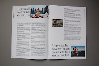
STUBBURBAN newsletter printed - Colour
Revised and reprintedthe STUBBURBAN newsletter in full colour. The main changes are on the type and layout inside the spreads. Amended a few errors that I noticed from the previous version. The other thing that has changed for this one is the front cover; the type settings has been shifted on each line where the text continues from the previous line. This makes the cover a bit more dynamic and challenges the reader to read it a bit more because it's stlightly harder to read. I personally prefer this one because the overall weight and composition of the cover seems a bit more balanced.






STUBBURBAN newsletter printed - Black & white
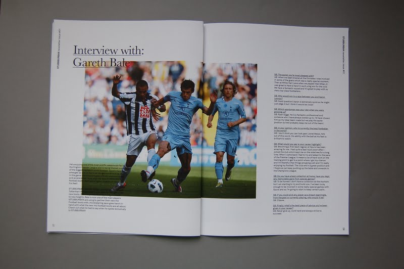
Printed STUBBURBAN newsletter printed in black & white. This was the direction I wanted to go, I didn't feel the need for the colour as a newsletter but Laura wants it in colour so we're going to try one out in colour aswell.
I'm quite pleased with the outcome of this, the size definitely feels right and appropriate. Didn't want to make it any bigger really as the content sits comfortably in the format of it. For a laser print, the quality has turned out pretty well, mainly because of the solid black and not grey's which it doesn't print out quite as well.


I'm quite pleased with the outcome of this, the size definitely feels right and appropriate. Didn't want to make it any bigger really as the content sits comfortably in the format of it. For a laser print, the quality has turned out pretty well, mainly because of the solid black and not grey's which it doesn't print out quite as well.


Sunday, 15 May 2011
STUBBURBAN newsletter final - print ready
Make some further adjustments with the layout, again mainly going through the type specification and layout to ensure that everything is consistent throughout. This will be printed in 2 version, a black & white laser print and a full colour one from the print room. I'm still not completely convinced with the final cover, but will see how this prints out, still have some time for amendments so will make the relevant changes if it's necessary.
STUBBURBAN Newsletter - final adjustments
Decided to go for the this direction, so spent some time developing and fine tuning the minor details particularly with the type specification and also experimenting with the use of the underline or no underline at all. When folded, only half of this list is revealed from each side, which invites the user to open it up to view it in a poster format. The contrast in the two different type orientations achieve a more dynamic and interesting composition, especially for this amount of text. It also brings in the back cover with the front into one, rather than having them as separate things.


Newsletter development 02
As part of the range, the last part was to develop a newsletter to promote the STUBBURBAN brand. These are the developments of what I had. Laura provided the content and the basic newsletter structure and between us decided on a suitable format and size based on the amount of content and images.


Newsletter cover designs
Front & back cover developments for the newsletter. We decided not to put any images in it, and instead wanted it to be purely typographical. The purpose of a newsletter is to promote and inform people of the latest information revolving around the brand, whether this is about a new collection or events for example. We had the idea to generate the type out of a list of what the newsletter contains, so acting as a contents page, this would be straight forwards and communicates the content in a straightforward way.
Below are some of the developments for the front/back cover designs.


Below are some of the developments for the front/back cover designs.


Newsletter development
As part of the range, the last part was to develop a newsletter to promote the STUBBURBAN brand. Laura provided the content and the basic newsletter structure and between us decided on a suitable format and size based on the amount of content and images. The newsletter would contain information about the latest range aswell as articles on relevant topics that relate to the brand itself and a feature on the pH collection.
The specification of the newsletter itself is 180mm x 250mm with 12 pages.
The specification of the newsletter itself is 180mm x 250mm with 12 pages.
Wednesday, 4 May 2011
STUBBURBAN - Revised look book & branded materials
Made the relevant adjustments and final revisions to the look book in terms of editing the photos, type specifications aswell as stock & printing considerations. The slip case and the front cover of the look book are printed on the 245gsm matte while the spreads are printed full colour on the 130gsm matte.

Stitch bind of the book adds a bit more detail to the quality of the book, I do like this extra detail to it, however the heavy matte stock doesn't seem to be the best option for folds so might have to make some adjustments to this.


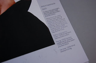


Branded clothes tags for the STUBBURBAN brand.


Letterheads with holes punched into them so that they encourage people to file them into a folder. This coincides with the holes punched into the tabs, which relates directly to the fashion.


Stitch bind of the book adds a bit more detail to the quality of the book, I do like this extra detail to it, however the heavy matte stock doesn't seem to be the best option for folds so might have to make some adjustments to this.


Branded clothes tags for the STUBBURBAN brand.


Letterheads with holes punched into them so that they encourage people to file them into a folder. This coincides with the holes punched into the tabs, which relates directly to the fashion.


Subscribe to:
Posts (Atom)