Open publication - Free publishing
Showing posts with label Brief 02 : Fakery. Show all posts
Showing posts with label Brief 02 : Fakery. Show all posts
Thursday, 2 June 2011

Friday, 20 May 2011
Revised Fakery Finals
Spent a day making final adjustments to the fakery printed materials. This is mainly with the publication, which has changed slightly in terms of the front over format.


Predictions Calendar Series


Predictions Calendar Series


Sunday, 24 April 2011
Fakery Revisited
So over the Easter break, I decided to dedicated a day or two on revisiting the Fakery brief, mainly because I wasn't too happy with the final execution of my idea. With the rush of getting it all completed for the ISTD deadline, I felt that what I had submitted seemed more of a final mockup rather than a final portfolio worthy piece.
I spent a long time working on the concept, the idea and the different methods of approach to get this brief nailed, and eventhough I'm not completely satisfied with what I have ended up with, I do feel that with a bit more time, I could make this a much stronger resolve to the brief.
I spent a long time working on the concept, the idea and the different methods of approach to get this brief nailed, and eventhough I'm not completely satisfied with what I have ended up with, I do feel that with a bit more time, I could make this a much stronger resolve to the brief.
Friday, 22 April 2011
ISTD Feedback
Received our assessment feedback from ISTD yesterday and was glad to find out that I had passed and been award membership to ISTD!
The feedback on my design and typographic skills were generally quite positive, however I seemed to have lost most my marks on the fact that I didn't submit any research work or visual development material documenting my design process, which I was not aware I had to submit! When they said 'A2 portfolio' I'm guessing they meant a whole folio of development/research and final outcomes and not just 5 design boards which I had submitted!
I'm please with the results considering I had only submitted the minimal amount and didn't really provide development work to their submission requirements. As suggested by the feedback sheet, I will spare some time towards the end of this module to revise and develop this brief a bit further.
The feedback on my design and typographic skills were generally quite positive, however I seemed to have lost most my marks on the fact that I didn't submit any research work or visual development material documenting my design process, which I was not aware I had to submit! When they said 'A2 portfolio' I'm guessing they meant a whole folio of development/research and final outcomes and not just 5 design boards which I had submitted!
I'm please with the results considering I had only submitted the minimal amount and didn't really provide development work to their submission requirements. As suggested by the feedback sheet, I will spare some time towards the end of this module to revise and develop this brief a bit further.
Thursday, 24 March 2011
ISTD Submission boards
Final submission boards for ISTD, these took much longer than expected as I had to ensure that my concept was communicated through clearly and the typographic specification was correct. Although it is submitted and technically completed, I feel that there are still plenty of things that I could improve and expand on. The feedback on this from the crit was generally quite positive, the issues that were quite confusing was generated from my concept of fake information which is good, proves that it did it's job making become discuss the information on it.
Design wise, I don't think that I've fully pushed the potential of it and feel that I could expand on a range of other materials which has been suggested by people during the crit. It was also recommended that I should take a break from this brief for now and go back to it later on to make adjustments and improvements later on, which sounds like some good advice for my current situation. So there it is, I will come back to this later on.
Design wise, I don't think that I've fully pushed the potential of it and feel that I could expand on a range of other materials which has been suggested by people during the crit. It was also recommended that I should take a break from this brief for now and go back to it later on to make adjustments and improvements later on, which sounds like some good advice for my current situation. So there it is, I will come back to this later on.
Fakery final design outcomes : Predictions Calendar Series & Publication
Final design outcomes for the Fakery brief : these include 6 duplex full colour prints of each month printed on 130gsm matte accompanied by a 72 page black & white booklet printed on 90gsm white & bound by a staple.




Wednesday, 23 March 2011
Predictions Publication final development
Further developed cover and spreads, the general layout of the publication would follow this generic format, therefore the details and all specifications need to be really precise so that the publication is consistent throughout. I worked mainly on the first month, dividing each section by week and then a break before the next month. This system would hopefully give the publication a sense of pace when flicking through, something that I value alot even for something that is supposed to be read as a manual.


Predictions publication development
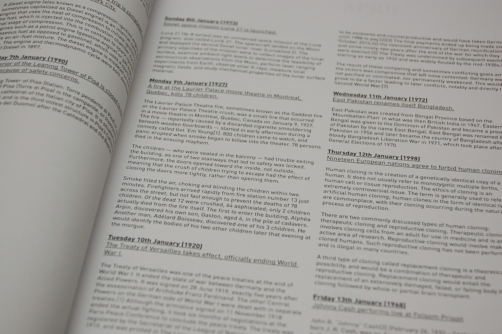
First print outs and mockups to test scale and to make a decision on which typeface to use for the copy. The scale of the publication feels really to nice, it's a slightly smaller version of an A4 sheet, and without the pages being folded for the bind, the spine feels really loose and light to hold, altogether adding to the interesting feel of the publication.
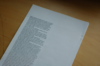
I wanted this to contain an almost manual-like feel to it, to contrast against the high volume of colour and content of the calendars, this publication was to be used as a reference book, therefore the emphasis was on the clarity of it, therefore stripped it down of any colour.
After experimenting with 2 sans serifs : Helvetica and DINpro and 2 serifs: Baskerville and Times New Roman, I felt that DINpro worked best for this, the serifs were probably the best for readability in this context but DINpro was used throughout the calendars and it felt to the most suitable one to use. This is something that will confirm itself as I develop this I think so will just work on DINpro for now and see where it goes from here.




I wanted this to contain an almost manual-like feel to it, to contrast against the high volume of colour and content of the calendars, this publication was to be used as a reference book, therefore the emphasis was on the clarity of it, therefore stripped it down of any colour.
After experimenting with 2 sans serifs : Helvetica and DINpro and 2 serifs: Baskerville and Times New Roman, I felt that DINpro worked best for this, the serifs were probably the best for readability in this context but DINpro was used throughout the calendars and it felt to the most suitable one to use. This is something that will confirm itself as I develop this I think so will just work on DINpro for now and see where it goes from here.


Predictions Publication Development
Initial publication layout and cover ideas and testing multiple different typefaces for the copy to start with. The structure of the publication would be quite simple, with an opening page for the introduction and concept explanation of the publication, followed by spreads of events categorised into weekly and monthly sections.
The first cover idea I worked on, contained the initial name of calling it predictions, whilst utilising the gradient effect to tie in with the calendars itself.


The first cover idea I worked on, contained the initial name of calling it predictions, whilst utilising the gradient effect to tie in with the calendars itself.


Predictions publications
With a couple more days spare before submitting this, I felt that I could potentially push brief a little further, although I did spend a lot of time thinking and trying to work out the concept for this, I don't think the calendars are grounded enough to work individually. In response to this I decided to develop a quick manual-like publication that would summarise the concept and provide a more in depth and comprehensive copy of each date, acting as an archive of all the events mentioned, which would ultimately reference the information on the calendars.
 So in contrast to the calendars, I wanted to keep the direction quite similar, so utilising some elements of the calendar but keeping the layout quite tight and consistent, focusing on readability, because it will be a text heavy document and quite minimal as I wanted the tone to be more of a manual that would accompany the calendars.

Final Calendars
These are the final calendars that I have developed. The content has been sourced from Wikipedia; I researched 366 days worth of events in the last century and picked out the ones that I felt were relavent. The idea of sourcing from the internet, reflects the fact that information from the internet is often false and tampered with which relates to Fakery. The final concept of this is called Predictions, the calendar basically contains false predictions of events that are infact referencing past events, which hopefully triggers nostalgic memories.
The colours introduced for each month follow the seasonal tones of the year, adding to the range while giving a different feel to the posters each month. Aswell as the events, there are also information and details for weather, moon status for each month and a statement of each month, which is simply an opinon but written as a fact. This aims to trigger discussions between people who either agree or disagree with the statements; this ties in with the concept of allowing the viewer decide whether something is fake or not.
In general I'm quite pleased with the layouts of these, they look rather appealing and seem to communicate the idea quite well, possibly a little subtle at times but this adds to the concept of fakery and the content being misleading and false.
The colours introduced for each month follow the seasonal tones of the year, adding to the range while giving a different feel to the posters each month. Aswell as the events, there are also information and details for weather, moon status for each month and a statement of each month, which is simply an opinon but written as a fact. This aims to trigger discussions between people who either agree or disagree with the statements; this ties in with the concept of allowing the viewer decide whether something is fake or not.
In general I'm quite pleased with the layouts of these, they look rather appealing and seem to communicate the idea quite well, possibly a little subtle at times but this adds to the concept of fakery and the content being misleading and false.
Final calendar adjustments / Mockups
Making a few final adjustments, mainly with the hierarchy of the type and layout. I felt that the previous ones were still a bit loose in terms of the event details and the calendar layout itself.
Open publication - Free publishing - More calendar
First print outs of the calendar in full scale before being trimmed. The type specifications looked pretty good in terms of the size, leading etc, but felt that the boxes were still a bit big for my liking and for the functional aspect of it. Because of the size of them, they stand out too much and they're not even the focus of the piece. On the other hand, the feedback on this was the the calendar arrangement being on the right seems a bit unnatural, so will consider reversing this. As much as I like Courier New, it didn't work for this at all, when printed out the type was just too small and almost impossible to read, so something that I'll have to revise for the final layouts.


After getting some feedback on the 1st printed mockups of the calendar, I've made some final adjustments. These include, reversing the calendar to the left side, changing the events details from Courier New to DINpro regular, and rescaled the tick boxes so they appear more subtle than before.
First print outs of the calendar in full scale before being trimmed. The type specifications looked pretty good in terms of the size, leading etc, but felt that the boxes were still a bit big for my liking and for the functional aspect of it. Because of the size of them, they stand out too much and they're not even the focus of the piece. On the other hand, the feedback on this was the the calendar arrangement being on the right seems a bit unnatural, so will consider reversing this. As much as I like Courier New, it didn't work for this at all, when printed out the type was just too small and almost impossible to read, so something that I'll have to revise for the final layouts.


After getting some feedback on the 1st printed mockups of the calendar, I've made some final adjustments. These include, reversing the calendar to the left side, changing the events details from Courier New to DINpro regular, and rescaled the tick boxes so they appear more subtle than before.
Development 2
More development adjusting the smaller details of the type and a few other layout arrangmenets of the calender and the event details.
Experimenting with alternative layouts and introducing colour to produce a range for different months.
Experimenting with alternative layouts and introducing colour to produce a range for different months.
Final Concept - Development
Development of calendar layouts.
Further development of layouts, taking a completely different approach with the layout but working within the same constraints of the format and scale.
Further development of layouts, taking a completely different approach with the layout but working within the same constraints of the format and scale.
Progression
After brainstorming numerous different concepts and routes, I decided I didn't want to base my ideas simply on a subject of fakery, such as plastic surgery,lying or fake brands for example. Instead I wanted to experiment with the idea of Fakery instead, so looking at the many different definitions and topics and trying to work out the reason behind fakery. Why would someone fake something, is fakery a good thing etc.
Initially this lead me to looking at various different things, such as dialogues, this was derived from Actors in films and the scripts that they'll have to follow. Also questioning to what extent something becomes fake, can faking something be good, because if we can't fake or tell a lie, they things will probably be a lot more difficult especially in a working environment.
Anyway, several ideas I had:
1. A fake publication/poster/booklet (whatever format) that basically told a story through image and type, the narrative of this would be a documentation of a false journey around the world. I wanted to focus the content on information from the internet, investigating the power of the net etc, so the content of this would all be sourced from the internet, such as wikipedia, statistics, google maps... This technically, is not fake information but information that is gathered and presented in a false context. I'd rely heavily on google maps and streets, taking photos of street view to use and present as my own holiday snaps.
The problem with this, is that it would require a substantial amount of time to research and it would require images to drive the visuals, which isn't really an advantage when doing an ISTD brief, so ditched this idea. Also i didn't really see any particular reason or purpose for doing this. It will be interesting for a creative's point of view but wouldn't have any commercial ground, but would this matter? Really wanted to make this but didn't feel that it was viable for submitting to ISTD. I want a winning concept and Im still not sure if this is strong enough for me to commit to.
2. The idea was that the definition of something being fake is dependent on whether the individual person receiving it believes that it's fake. So a study of unresolved topics that has mixed opinions and therefore there is no clear right or wrong, basically going down the route of conspiracy theories. I wanted to title this" 'True or False' and the publication would basically be filled with True or False questions based on several topics, such as Religion, is god real? Global Warming, 911, Bruce Lee's death, Diana's death, UFOs etc....
3. Looking at fakery as a positive thing. I wanted to produce something functional that's not a publication for once. So the idea is to design a wall hanging calendar. The calendar will contain information for relevant dates, on a standard calendar you'd expext dates like Christmas and New Year, but this calendar will include other dates such as events, weather etc. And ofcourse, this is almost impossible to do, especially for things like the weather. SO, the idea is the have the information there, written as if it's predicting the future, but infact it's referencing past events. EG, one of the ones I've written is: Sputnik 1 is expected to fall to earth from it's orbit - January 4th 2012. This is false obviously because it's happened over 10 years or so ago now, but in a way this informs and educated the reader, for that particular day. This is actually the concept I've been working on the most really, generating calendar layouts and researching events and details for January. See attached for the current layout. But after printing a mockup and looking at it, it just doesn't seem very strong at all, and the concept isn't very clear. It feel that I've just done a calendar and banged the events onto it. Maybe with the layout adjustments this could be refined? Format wise it's currently just under A2, each month as a separate sheet (not very eco I know), folded into just under A4 and package with a small publication accompanying it with concept and all dated and correct references.
4. My most current idea is a publication that records and presents the experimentation of several people's journey through the internet. I really want to utilise Wikipedia for this as it would generate copy and relates my original theme of looking at information generated from the internet. Wikipedia is a prime example of content being shared and taken for granted, when it's not the most reliable source. The concept of this would be to look at the process of several people clicking from one Wikipedia page to another, so it would be a record of their choices, which becomes the 'journey' For example, if you were to do this, you'd start at one page and click your way through 10 words that draws your attention. Someone along the lines of that anyway, and the publication would basically document the content and the links between each article.
The problem with this one is..... I'm still struggling to find a link with FAKERY! Maybe it's the title of the book that's misleading or something, but not sure.
Other ideas include using Lorem Ipsum, creating a series of typefaces that somehow have a link with fakery, whether it is the formal elements or concept and various others that aren't really worth mentioning. Besides I think there's quite a lot to take in already so better shut up. I've actually clarified the whole thing alot more for myself just writing this! So will blog later aswell! haha.
I think it general, it's thinking about the concept and how it fits into my schedule this week, whilst still providing a solid platform to experiment with type.
Hopefully in the next day i should have a more solid idea of where I'd like to take this so I can really get down to working on the design aspect of it.
Initially this lead me to looking at various different things, such as dialogues, this was derived from Actors in films and the scripts that they'll have to follow. Also questioning to what extent something becomes fake, can faking something be good, because if we can't fake or tell a lie, they things will probably be a lot more difficult especially in a working environment.
Anyway, several ideas I had:
1. A fake publication/poster/booklet (whatever format) that basically told a story through image and type, the narrative of this would be a documentation of a false journey around the world. I wanted to focus the content on information from the internet, investigating the power of the net etc, so the content of this would all be sourced from the internet, such as wikipedia, statistics, google maps... This technically, is not fake information but information that is gathered and presented in a false context. I'd rely heavily on google maps and streets, taking photos of street view to use and present as my own holiday snaps.
The problem with this, is that it would require a substantial amount of time to research and it would require images to drive the visuals, which isn't really an advantage when doing an ISTD brief, so ditched this idea. Also i didn't really see any particular reason or purpose for doing this. It will be interesting for a creative's point of view but wouldn't have any commercial ground, but would this matter? Really wanted to make this but didn't feel that it was viable for submitting to ISTD. I want a winning concept and Im still not sure if this is strong enough for me to commit to.
2. The idea was that the definition of something being fake is dependent on whether the individual person receiving it believes that it's fake. So a study of unresolved topics that has mixed opinions and therefore there is no clear right or wrong, basically going down the route of conspiracy theories. I wanted to title this" 'True or False' and the publication would basically be filled with True or False questions based on several topics, such as Religion, is god real? Global Warming, 911, Bruce Lee's death, Diana's death, UFOs etc....
3. Looking at fakery as a positive thing. I wanted to produce something functional that's not a publication for once. So the idea is to design a wall hanging calendar. The calendar will contain information for relevant dates, on a standard calendar you'd expext dates like Christmas and New Year, but this calendar will include other dates such as events, weather etc. And ofcourse, this is almost impossible to do, especially for things like the weather. SO, the idea is the have the information there, written as if it's predicting the future, but infact it's referencing past events. EG, one of the ones I've written is: Sputnik 1 is expected to fall to earth from it's orbit - January 4th 2012. This is false obviously because it's happened over 10 years or so ago now, but in a way this informs and educated the reader, for that particular day. This is actually the concept I've been working on the most really, generating calendar layouts and researching events and details for January. See attached for the current layout. But after printing a mockup and looking at it, it just doesn't seem very strong at all, and the concept isn't very clear. It feel that I've just done a calendar and banged the events onto it. Maybe with the layout adjustments this could be refined? Format wise it's currently just under A2, each month as a separate sheet (not very eco I know), folded into just under A4 and package with a small publication accompanying it with concept and all dated and correct references.
4. My most current idea is a publication that records and presents the experimentation of several people's journey through the internet. I really want to utilise Wikipedia for this as it would generate copy and relates my original theme of looking at information generated from the internet. Wikipedia is a prime example of content being shared and taken for granted, when it's not the most reliable source. The concept of this would be to look at the process of several people clicking from one Wikipedia page to another, so it would be a record of their choices, which becomes the 'journey' For example, if you were to do this, you'd start at one page and click your way through 10 words that draws your attention. Someone along the lines of that anyway, and the publication would basically document the content and the links between each article.
The problem with this one is..... I'm still struggling to find a link with FAKERY! Maybe it's the title of the book that's misleading or something, but not sure.
Other ideas include using Lorem Ipsum, creating a series of typefaces that somehow have a link with fakery, whether it is the formal elements or concept and various others that aren't really worth mentioning. Besides I think there's quite a lot to take in already so better shut up. I've actually clarified the whole thing alot more for myself just writing this! So will blog later aswell! haha.
I think it general, it's thinking about the concept and how it fits into my schedule this week, whilst still providing a solid platform to experiment with type.
Hopefully in the next day i should have a more solid idea of where I'd like to take this so I can really get down to working on the design aspect of it.
Concept Development - Calendar idea
Another idea is to develop a calendar that would contain false information, playing with the idea of creating false hope for something that wouldn't necessarily happen. This obviously relates to the subject of fakery because the content would most likely be made up.
These were the initial typefaces I tested out quite briefly for the calendars. Wasn't sure as of yet what and who I would be aiming this at, as it's still a very early idea playing with the conventional format of a calendar and embedding false information within it.
As it was for ISTD submission, It was a requirement that it needed to be typographically driven, so it was a consideration that I needed to develop a concept that would allow be to push the use of type and less of the use of imagery and photography. The concept of developing a calendar I felt was a strong solution to this, it provided a good format while giving me plenty of scope to research into.
SO, the concept of this is to develop a calendar that would contain false events for each date, including weather forcase, the humidity levels, natural events etc. Below are a few initial layout ideas for how the calendar could be developed. Because there will be quite a lot of content, I decided that the format would be a large A2 sheet for each month, this would provide plenty of space for the type and information while still being an engaging outcome.
These were the initial typefaces I tested out quite briefly for the calendars. Wasn't sure as of yet what and who I would be aiming this at, as it's still a very early idea playing with the conventional format of a calendar and embedding false information within it.
As it was for ISTD submission, It was a requirement that it needed to be typographically driven, so it was a consideration that I needed to develop a concept that would allow be to push the use of type and less of the use of imagery and photography. The concept of developing a calendar I felt was a strong solution to this, it provided a good format while giving me plenty of scope to research into.
SO, the concept of this is to develop a calendar that would contain false events for each date, including weather forcase, the humidity levels, natural events etc. Below are a few initial layout ideas for how the calendar could be developed. Because there will be quite a lot of content, I decided that the format would be a large A2 sheet for each month, this would provide plenty of space for the type and information while still being an engaging outcome.
Ideas development
I had several different ideas in mind, instead of going for one which is extremely difficult to decide on, I went for a few different routes first to see how they developed. One of them was the idea of looking at scripts and the dialogues that actors will have to follow, so acting as a theme relating to fakery.
The concept of this was 'how not to be brutally honest', taking the ideas of scripts and approaching with common phrases that we would benefit from in our daily lives. An example of this would be providing a script for diverting a difficult question that is asked.
Below are a few quick cover ideas to start the ball rolling.
Spreads development, which should help explain this idea a bit more.

 After speaking to a few people around the studio and getting some feedback on this initial idea, I decided to move on from this as it didn't seem like there was much scope to the concept. It was quite clear what the idea was, but seemed quite obvious still and there is the risk of it becoming too dry.
The concept of this was 'how not to be brutally honest', taking the ideas of scripts and approaching with common phrases that we would benefit from in our daily lives. An example of this would be providing a script for diverting a difficult question that is asked.
Below are a few quick cover ideas to start the ball rolling.
Spreads development, which should help explain this idea a bit more.


Ideas & concepts
Initial ideas, mainly focusing on trying to figure out what I want to get out of this brief, what are the brief's requirements and the possibilities of different ideas.


Subscribe to:
Posts (Atom)