Open publication - Free publishing
Showing posts with label Brief 09 : Editions of 24hrs. Show all posts
Showing posts with label Brief 09 : Editions of 24hrs. Show all posts
Thursday, 2 June 2011

Tuesday, 24 May 2011
Editions of 24hrs catalogue
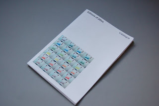
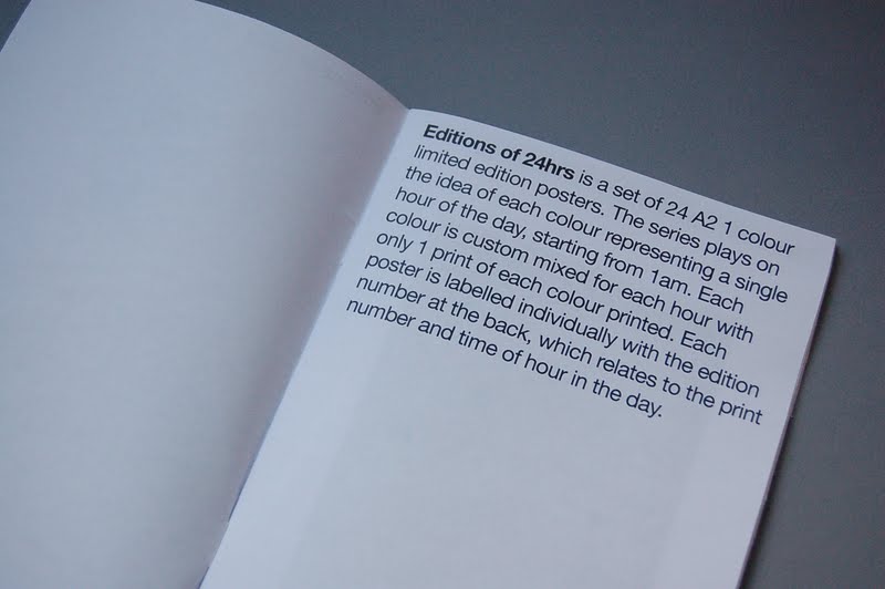
After having to explain the whole concept behind these posters to Bridget the other day, I felt that I needed to clarify this especially as It's something for the popup shop, a place where I'm hoping people would buy the posters! It woulnd't be very useful if they didn't understand it, so I decided to resolve this problem by coming up with a very quick catalogue that explains the concept and shows the whole set as a collection of 24 posters.
It needed to be very simple and straight to the point, with the front cover pretty much explaining the whole things, there's the title and the whole collection of images where the colour variations are quite obvious. It has been printed in colour on 90gsm uncoated stock and stapled together. This will sit next to the pile of posters, giving potential buyers an alternative to physically flicking through all the posters and trying to work out what they are about.


The details at the top of each page are self explanatory, the key thing is that there is a Sold box, allowing the vendor to tick off what's sold, again reinforcing the idea of them being limited edition and once they are gone, they're gone forever!!!


It needed to be very simple and straight to the point, with the front cover pretty much explaining the whole things, there's the title and the whole collection of images where the colour variations are quite obvious. It has been printed in colour on 90gsm uncoated stock and stapled together. This will sit next to the pile of posters, giving potential buyers an alternative to physically flicking through all the posters and trying to work out what they are about.




The details at the top of each page are self explanatory, the key thing is that there is a Sold box, allowing the vendor to tick off what's sold, again reinforcing the idea of them being limited edition and once they are gone, they're gone forever!!!


Monday, 23 May 2011


Monday, 16 May 2011
Editions of 24 hours finals
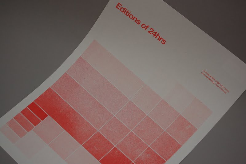
Final set of 24 A2 1 colour limited edition posters. The series plays on the idea of each colour representing a single hour of the day, starting from 1AM. Each colour is custom mixed for each hour and there is only 1 print of each colour, therefore technically making them each limited editions of 1. This resolution plays on a novelty idea of something being limited edition of 1 because of the process and colours that make them; something that I felt was suitable for a popup shop.
I will be selling these for £8 at the pop up shop, a price that I feel is reasonable without making it too overpriced or too low in price to make them feel a bit cheap. Realistically I don't think I'll be selling many of these if any, so I am planning on using these as promotional/ gifts to leave with people during studio visits. It's also an interesting addition to add to my online website. Either as a showcase or something that people can actually buy.


I will be selling these for £8 at the pop up shop, a price that I feel is reasonable without making it too overpriced or too low in price to make them feel a bit cheap. Realistically I don't think I'll be selling many of these if any, so I am planning on using these as promotional/ gifts to leave with people during studio visits. It's also an interesting addition to add to my online website. Either as a showcase or something that people can actually buy.

Friday, 13 May 2011
Editions of 24hrs booklet
Due to the method of screenprinting that I was using for the posters, I had to flood and print once onto newsprint first before printing on the actual stock for every separate colour. This allows the ink to refresh itself and for the new colour to be flooded through the screen ready for the actual print, therefore I had a pile of newsprints with test prints all over them, some of these were overprinted and some that hardly worked at all.
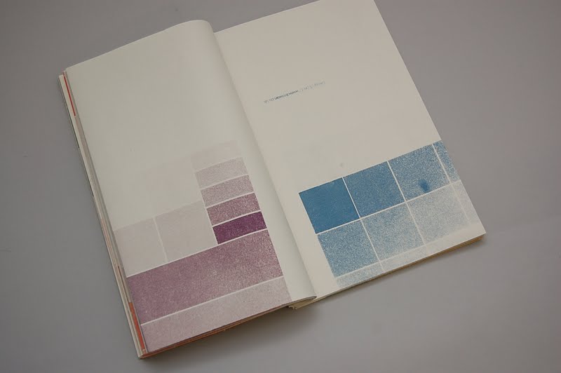
I decided to put these together into a book as they seemed a bit oversize to keep a record of. The book basically consists of all these sheets folded twice and bound together with 2 bulldog clips. It offers a management and easy to view format of the prints, and although only a fraction of the prints are exposed, you still get an idea of the print quality and always have the freedom to unclip and open them up individually.
The spreads themselves work really well even if they don't have much meaning to them. The colour and tactile quality of the prints make up for the lack of real content. There isn't much of a concept behind this really as this is simply the result of just using up existing materials, but this format and the process of how it's been put together is quite interesting.

Due to the way it is bound, the edges of the pages are printed on aswell, forming an interesting spectrum of colours and patterns due to the halftone effect.


The ordered yet random composition of shapes, type, textures and colours on each spread has a certain appeal to me and perhaps other people who are passionate or have an interest in manual printing.


I decided to put these together into a book as they seemed a bit oversize to keep a record of. The book basically consists of all these sheets folded twice and bound together with 2 bulldog clips. It offers a management and easy to view format of the prints, and although only a fraction of the prints are exposed, you still get an idea of the print quality and always have the freedom to unclip and open them up individually.
The spreads themselves work really well even if they don't have much meaning to them. The colour and tactile quality of the prints make up for the lack of real content. There isn't much of a concept behind this really as this is simply the result of just using up existing materials, but this format and the process of how it's been put together is quite interesting.

Due to the way it is bound, the edges of the pages are printed on aswell, forming an interesting spectrum of colours and patterns due to the halftone effect.


The ordered yet random composition of shapes, type, textures and colours on each spread has a certain appeal to me and perhaps other people who are passionate or have an interest in manual printing.



Final posters - Completed set
Managed to get all of my 24 (and a few spares) printed today ready for the popup shop. I did encounter numerous obstacles on the way including splitting the screen and having issues mixing the right colours, which meant that I did spend an extra morning finishing the rest of the prints.
The final outcomes however have turned out pretty nicely, their are a few inconsistent details with them but that's the nature of screenprinting really, which I like. I managed to get roughly all the colours and tones that I had aimed for, and together as a set they do look quite appealing.
The stickers that I had designed earlier have been placed on the top right at the back of each poster so that when they are rolled up, the sticker will remain visible to the buyer/user.


The final outcomes however have turned out pretty nicely, their are a few inconsistent details with them but that's the nature of screenprinting really, which I like. I managed to get roughly all the colours and tones that I had aimed for, and together as a set they do look quite appealing.
The stickers that I had designed earlier have been placed on the top right at the back of each poster so that when they are rolled up, the sticker will remain visible to the buyer/user.




Production progress
Dedicated a full day today to hopefully screenprint all if not most of the posters today for the pop up shop. Eventhough I'm only printing 24 posters, the process would take much longer than usual as I'll be manually mixing a new colour after every print so that each print is different.
The technique was to ensure that the screen is flooded before stopping to mix another colour as this prevents it from blocking up from the dry paint that's left on it. Although it wasn't too difficult, this process was extremely time consuming, especially when you're required to wash the screen again when you need to print a completely different colour.
To make my day worse, the screen had split after a few hours of printing, right in the middle of my design so was forced to stop and revise the situation. I ended up deciding to strip and prepare another screen as my whole set of posters would only work as a set. This just shows how temperamental screenprinting can be, but also the unique and interesting thing about it compared to digital.


The technique was to ensure that the screen is flooded before stopping to mix another colour as this prevents it from blocking up from the dry paint that's left on it. Although it wasn't too difficult, this process was extremely time consuming, especially when you're required to wash the screen again when you need to print a completely different colour.
To make my day worse, the screen had split after a few hours of printing, right in the middle of my design so was forced to stop and revise the situation. I ended up deciding to strip and prepare another screen as my whole set of posters would only work as a set. This just shows how temperamental screenprinting can be, but also the unique and interesting thing about it compared to digital.


Wednesday, 11 May 2011
1st attempt to print
Had to change my poster size today due to the print room being fully booked for the large format printer, but managed to get my negative printed onto trace today on A2.


Tuesday, 10 May 2011


Subscribe to:
Posts (Atom)