Open publication - Free publishing
Showing posts with label Brief 05 : Garry Barker. Show all posts
Showing posts with label Brief 05 : Garry Barker. Show all posts
Thursday, 2 June 2011

Saturday, 14 May 2011
Revised Garry Barker - Printed
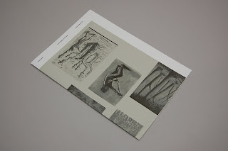
Revised and printed Garry Barker publication so far. I want to make adjustments to the etching book which sits inside it aswell as potentially changing the order of the biography in the publication from being the 2nd page to the middle spread.


Friday, 13 May 2011
Garry Barker publication revised
Spent an evening refining the initial Garry Barker publication that I had developed earlier for the pitch, which did not get chosen. Although it's a relatively small brief as it was just a pitch, I felt that what I had produced contained something that added to my portfolio, therefore decided to spend a bit more time developing the spreads and design of it, paying more attention to the smaller details, which I did not have time to focus on before.
Below are the revised spreads. The development focuses more on the order and content of the publication with attention to the flow of information and how it is presented. I felt that the previous version was a bit repetitive with 2 covers saying Garry Barker + exhibition details. Instead I decided to make the wrap around cover which will be printed on a different stock a poster, displaying a number f GB's work in black & white. This makes use of the different coloured stock whilst making the cover and first page interact as the name of the publication/artist is revealed from the way the publication is put together.
Aswell as making adjustments to the overall layout and margin specifications, I've also made the type smaller with corresponding leading adjustments. I managed to get the actual copy from Garry for his biography, so changed the whole layout of the biography page, this I might place in the centre of the publication instead.


Cover developments. The first one was the original one that I had for the pitch, printing on coloured stock which I felt was quite appropriate and wanted to retain. As an exhibition book and publication to showcase Garry's work, I wasn't too sure with a complete typographic front cover so experimenting with layouts with his work instead.
My further developments extended this idea to it being a poster instead, which people can either retain attached to the book or pull off and hang on the wall. I made a few more adjustments with the layouts, added the details to the back of it and made all the image greyscale to print onto the coloured stock.


Below are the revised spreads. The development focuses more on the order and content of the publication with attention to the flow of information and how it is presented. I felt that the previous version was a bit repetitive with 2 covers saying Garry Barker + exhibition details. Instead I decided to make the wrap around cover which will be printed on a different stock a poster, displaying a number f GB's work in black & white. This makes use of the different coloured stock whilst making the cover and first page interact as the name of the publication/artist is revealed from the way the publication is put together.
Aswell as making adjustments to the overall layout and margin specifications, I've also made the type smaller with corresponding leading adjustments. I managed to get the actual copy from Garry for his biography, so changed the whole layout of the biography page, this I might place in the centre of the publication instead.


Cover developments. The first one was the original one that I had for the pitch, printing on coloured stock which I felt was quite appropriate and wanted to retain. As an exhibition book and publication to showcase Garry's work, I wasn't too sure with a complete typographic front cover so experimenting with layouts with his work instead.
My further developments extended this idea to it being a poster instead, which people can either retain attached to the book or pull off and hang on the wall. I made a few more adjustments with the layouts, added the details to the back of it and made all the image greyscale to print onto the coloured stock.


Thursday, 10 February 2011
Pitch
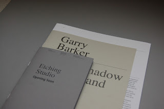
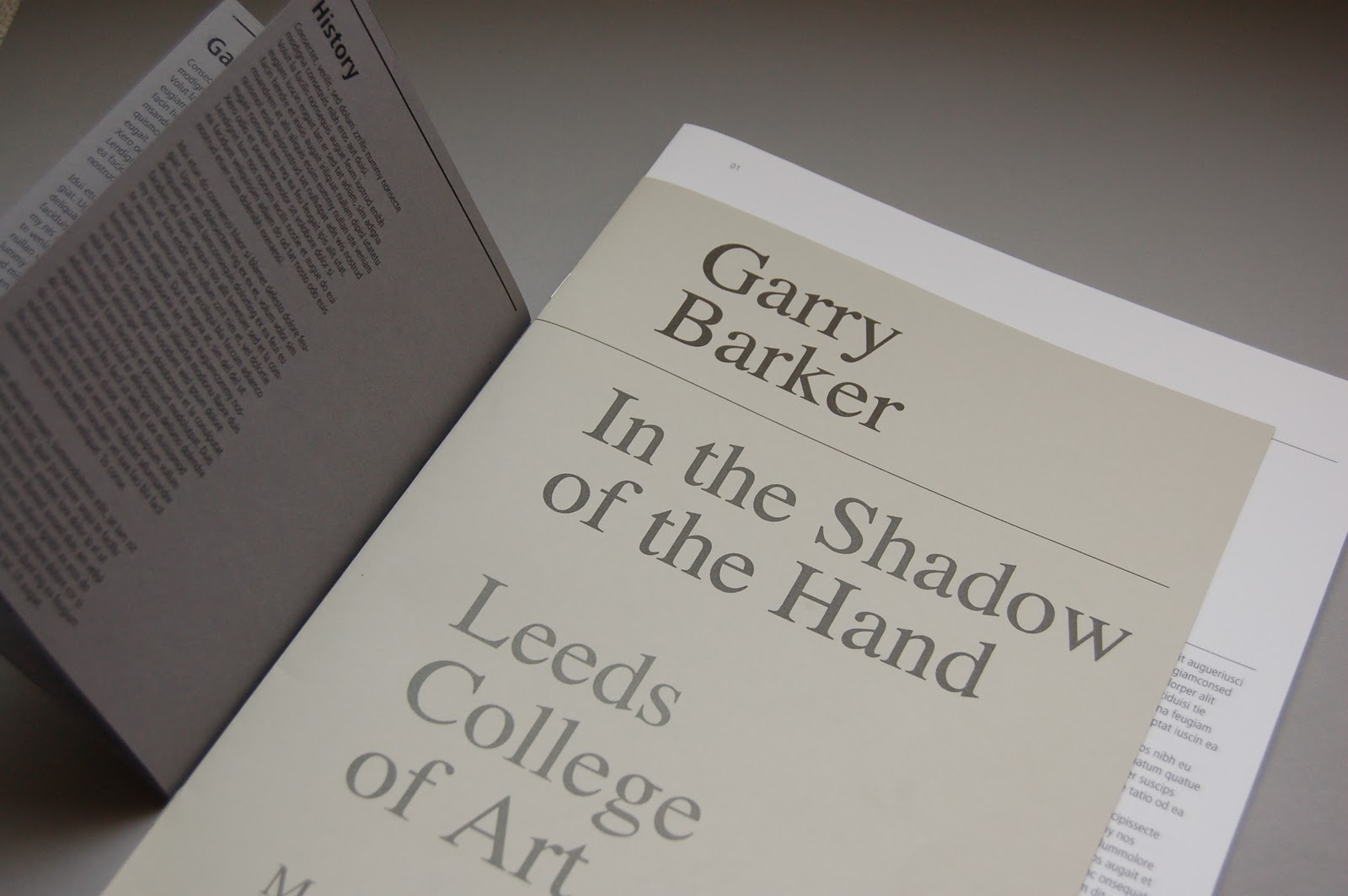
With little time left to work on this, I was only able to make a few spreads of the exhibition guide and a separate booklet for the etching studio. I wasnted to develop several other ranges for this, but wasn't able to due to the lack of time that I had left myself to work on this. I am quite pleased with the mock up though, the quality of the prints turned out really well, the colours chosen and tactile quality of the various stocks work well together. The identity is carries across all materials through the consistent type treatments and layout specification.
I limited the use of colour throughout, keeping it quite monotone, while only introducing elements of colour and tone with the stocks and for the work that's showcased. I would have liked to be able to develop a few more spreads for this really, so that the booklet overall has a more realistic number of pages, which alters the feel of the publication altogether.



I limited the use of colour throughout, keeping it quite monotone, while only introducing elements of colour and tone with the stocks and for the work that's showcased. I would have liked to be able to develop a few more spreads for this really, so that the booklet overall has a more realistic number of pages, which alters the feel of the publication altogether.




Mock up
Mock ups to test scale, type specification and general proof of the quality and feel of it in full scale. The size it in between an A4 & A3, which feels really nice to hold and appropriate for this type of work.


Etching studio booklet, this is only 4 pages, I wanted to keep the design quite simple again, so it fits within the whole aesthetics of the overal booklet.


Etching studio booklet, this is only 4 pages, I wanted to keep the design quite simple again, so it fits within the whole aesthetics of the overal booklet.


Development
Development of front cover layouts. This will be printed externally and wraps around the booklet itself. I intend to use the 130gsm white matte stock for this, Garry Barker's work is very detailed, with lots of mark making techniques therefore wanted something quite clean so that the work is represented in the best stock possible. This also fits within the budget aswell, allowing a more flexible budget for the other materials such as the cover insert and other external booklets etc.
The size I specified is 250mmx350mm for the main booklet, therefore reduced 20mm for both the width and height of the cover so that part of the content is revealed behind it.
Development of the spreads for the main publication. Clarity and was the emphasis on these layouts, the focus of the guide would be to provide information and showcase the work, so wanted to keep the type as clean and out the way as possible, allowing more space to place the images of the work. I didn't want it to too minimal however as it is a booklet for the art sector so experimented a bit more with the headings, merging serifs and san serifs for the type. Due to the concept of the publication of being able to dissect the book and take it apart into separate sections, the front cover/contents page would work without the wrap around cover.
Development of the Etching Studio promo, this will be a separate publication that would be attached with the rest of the publication. This demonstrates the possibilities of how the publication could work as a collective of separate pieces and as a whole.
The size I specified is 250mmx350mm for the main booklet, therefore reduced 20mm for both the width and height of the cover so that part of the content is revealed behind it.
Development of the spreads for the main publication. Clarity and was the emphasis on these layouts, the focus of the guide would be to provide information and showcase the work, so wanted to keep the type as clean and out the way as possible, allowing more space to place the images of the work. I didn't want it to too minimal however as it is a booklet for the art sector so experimented a bit more with the headings, merging serifs and san serifs for the type. Due to the concept of the publication of being able to dissect the book and take it apart into separate sections, the front cover/contents page would work without the wrap around cover.
Development of the Etching Studio promo, this will be a separate publication that would be attached with the rest of the publication. This demonstrates the possibilities of how the publication could work as a collective of separate pieces and as a whole.
Idea / Concept / format
From the brief itself and the briefing delivered by Garry the other week, I established that he wanted something that experimented with the conventions of a publication. The main aim was to produce a catalogue/exhibition guide for Garry Barker that would showcase his work, provide information about him as an artist who has been around for a while.
Garry specified that he will intent to use a local printers who did mostly zines, he wanted to push the boundaries of what they did by the design that we come up with. So essentially, we were to experiment with formats for an exhibition guide which would host as the main promotional materials aswell. The solution must fit within the budget, need to be adaptable for further editions and needs to provide infomation about his etching studio, work, background and writings.


 The concept I went for was to produce a number of smaller publications/booklets which would either be bound together or held together by an alternative binding option. This would allow the individual publicatiions to be taken apart aswell as being in a complete publication.
This concept would benefit it terms of the production side of things, the spreads was proposed to be printed with the intended printers, the wrap around cover would be printed from an alternative source on a separate stock. This would add a more interesting finish to the whole publication while introducing the adaptability of the publication. For example, future publications could be printed with the same printers and the cover would utilise an different stock and print finish.


Garry specified that he will intent to use a local printers who did mostly zines, he wanted to push the boundaries of what they did by the design that we come up with. So essentially, we were to experiment with formats for an exhibition guide which would host as the main promotional materials aswell. The solution must fit within the budget, need to be adaptable for further editions and needs to provide infomation about his etching studio, work, background and writings.


This concept would benefit it terms of the production side of things, the spreads was proposed to be printed with the intended printers, the wrap around cover would be printed from an alternative source on a separate stock. This would add a more interesting finish to the whole publication while introducing the adaptability of the publication. For example, future publications could be printed with the same printers and the cover would utilise an different stock and print finish.


Saturday, 5 February 2011
No.Zine
As part of researching for Garry Barker's publication brief, I remember him saying that the printers he wanted to get the materials printed was Footprint who are a Leeds based printers who specialised and did a lot of local zines. Garry wanted to push what the printers could do so it would be design driven. By the looks of the site, they don't really do any special finishes, nor will the budget allow this anyway, so the things that I can experiment with would be the stock, size, type, layout and general design direction and pushing the boundaries of the conventions of a publication(s).
I came across No.Zine, a self initiated project by Patrick Fry, the concept was to collaborate with illustrators, designers, writers, photographers and other creatives alike, to contribute material for the zine, which would be themed under the issue number. The format's quite nice and the concept is something that I would like to work on and manage aswell so it's interesting to see something that's actually been produced and available to purchase.
Although it is a zine, which is generally made within a tight budget, No.Zine demonstrates some interesting design elements that make it less Zine like. Something that I'm having to explore myself for the GB brief.
Anyway, here are a few sample covers and spreads from No.Zine.


I came across No.Zine, a self initiated project by Patrick Fry, the concept was to collaborate with illustrators, designers, writers, photographers and other creatives alike, to contribute material for the zine, which would be themed under the issue number. The format's quite nice and the concept is something that I would like to work on and manage aswell so it's interesting to see something that's actually been produced and available to purchase.
Although it is a zine, which is generally made within a tight budget, No.Zine demonstrates some interesting design elements that make it less Zine like. Something that I'm having to explore myself for the GB brief.
Anyway, here are a few sample covers and spreads from No.Zine.


Subscribe to:
Posts (Atom)