The design context publication has changed from A4 to 189mmx245mm AKA Crown Quarto on Lulu.com! Made some quick spread layouts with existing content that I had, playing with different column widths and how the type could sit on this format.
The cover definitely needs work to begin with. With the spreads, already I prefer the option of having 2 solid columns of text without it seeming too overwhelming. But more to come when I start placing the actual content in.
Tuesday, 24 May 2011
Change of format
Having printed out a 2 mockups and being able to flick through and compare the feel of the publication and the how it works with the layout, I'm starting to reconsider the format that I had initially picked. Although the A4 size was good and felt quite nice to begin with, I didn't feel that the layout worked well with it. I was never sure about the narrow columns; they worked well enough when there was alot of copy, but when there wasn't the spreads just looked really empty, making the publication itself seem quite incomplete.
After some thought on this, and considering the different sizes that are available, I was left with a choice of 4 sizes. The A4 size was what I had printed for the print quality mock up, this felt nice to start with but gradually felt a bit like a text book, especially with the glossy finish on the cover. Due to the image quality sourced from the internet from secondary research, it wasn't wise to make the publication any bigger than A4 as the images would not be suitable for print quality at all, therefore the only option was to downscale. The 2nd option; 194x269 was the scaled down version of the publication from A4 size, printed in black & white for my mockup. Although this was intentional, it feels quite nice, it isn't the familiar A4 size but still has the scale to hold the content together. A5 was too small I think, especially after the bind, there woulnd't be much space to place the images at all, also A5 just seems a bit too standard for a book. Finally I came to the conclusion of using 189mmx245, an option that is available through Lulu! It definitely feels a lot more appropriate for what I'm doing in terms of the layout options and the general feel of it. It's slightly smaller than A4 but wider in ratio. For what I'm doing and the images I have to work with, I think this format is alot more suitable.
SO 189mm x 245 it is!
After some thought on this, and considering the different sizes that are available, I was left with a choice of 4 sizes. The A4 size was what I had printed for the print quality mock up, this felt nice to start with but gradually felt a bit like a text book, especially with the glossy finish on the cover. Due to the image quality sourced from the internet from secondary research, it wasn't wise to make the publication any bigger than A4 as the images would not be suitable for print quality at all, therefore the only option was to downscale. The 2nd option; 194x269 was the scaled down version of the publication from A4 size, printed in black & white for my mockup. Although this was intentional, it feels quite nice, it isn't the familiar A4 size but still has the scale to hold the content together. A5 was too small I think, especially after the bind, there woulnd't be much space to place the images at all, also A5 just seems a bit too standard for a book. Finally I came to the conclusion of using 189mmx245, an option that is available through Lulu! It definitely feels a lot more appropriate for what I'm doing in terms of the layout options and the general feel of it. It's slightly smaller than A4 but wider in ratio. For what I'm doing and the images I have to work with, I think this format is alot more suitable.
SO 189mm x 245 it is!
Spread development - filling with content
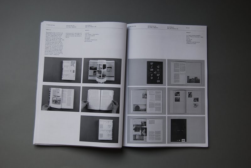
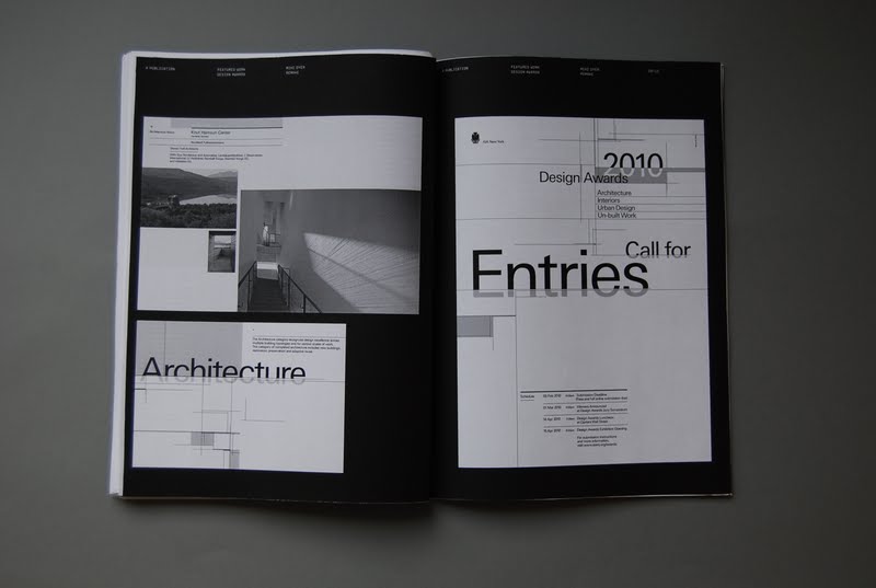
In the past 2 weeks, I've gradually been receiving the content from the design studios that I have emailed to feature in the publication, so the direction has slowly developed and refined alot more with real content. There has been quite a few changes with the design direction and details of the publication, but at the moment most of it is just adjusting and trying to define a solid direction and identity for it that would run across the whole thing.
Here are some of the more prominent spreads out of the 80; quite a diverse range really all working with the modular grid that's been set. The good thing I'm starting to notice about having so many pages is that I can be more flexible with the layout and have more variations running through the whole thing and it would still look consistent.
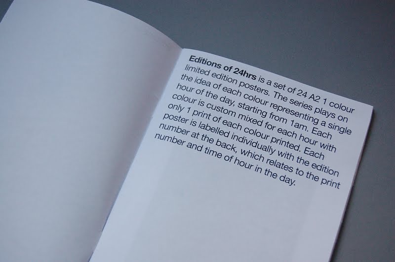
Editions of 24hrs catalogue
After having to explain the whole concept behind these posters to Bridget the other day, I felt that I needed to clarify this especially as It's something for the popup shop, a place where I'm hoping people would buy the posters! It woulnd't be very useful if they didn't understand it, so I decided to resolve this problem by coming up with a very quick catalogue that explains the concept and shows the whole set as a collection of 24 posters.
It needed to be very simple and straight to the point, with the front cover pretty much explaining the whole things, there's the title and the whole collection of images where the colour variations are quite obvious. It has been printed in colour on 90gsm uncoated stock and stapled together. This will sit next to the pile of posters, giving potential buyers an alternative to physically flicking through all the posters and trying to work out what they are about.
The details at the top of each page are self explanatory, the key thing is that there is a Sold box, allowing the vendor to tick off what's sold, again reinforcing the idea of them being limited edition and once they are gone, they're gone forever!!!
It needed to be very simple and straight to the point, with the front cover pretty much explaining the whole things, there's the title and the whole collection of images where the colour variations are quite obvious. It has been printed in colour on 90gsm uncoated stock and stapled together. This will sit next to the pile of posters, giving potential buyers an alternative to physically flicking through all the posters and trying to work out what they are about.
The details at the top of each page are self explanatory, the key thing is that there is a Sold box, allowing the vendor to tick off what's sold, again reinforcing the idea of them being limited edition and once they are gone, they're gone forever!!!
Monday, 23 May 2011
Saturday, 21 May 2011
First printed mockup
Got the first mock up of the design context publication printed today in black and white, just how it will be printed through Lulu. I managed to put enough of the content together with a more revised layout now, I felt that it was about time that I got the whole publication printed out in one go so I can get an idea of the scale, thickness and physical feel of the book itself.
Currently I've gone way over my page estimation of 144 and have ended up with 160 pages so far. This includes all the filler pages, breaks, interviews and extra pages at the beginning and back of the publication so the final page count shouldn't differ to much to this. Content wise I'm still waiting for a couple more interviews to come in next week and a few featured projects which I'll just need to place into the document. The most difficult part of structuring the book itself is done to a good standard at the moment, but printing it out should allow me to identify and problems with it.
Spreads have been printed on black & white laser on 90gsm stock whereas the cover has been printed on a gloss to resemble the finish of what Lulu does. A wrap around poster will be developed to go round the whole publication, something I need to start looking into properly soon.
Selection of spreads:
Currently I've gone way over my page estimation of 144 and have ended up with 160 pages so far. This includes all the filler pages, breaks, interviews and extra pages at the beginning and back of the publication so the final page count shouldn't differ to much to this. Content wise I'm still waiting for a couple more interviews to come in next week and a few featured projects which I'll just need to place into the document. The most difficult part of structuring the book itself is done to a good standard at the moment, but printing it out should allow me to identify and problems with it.
Spreads have been printed on black & white laser on 90gsm stock whereas the cover has been printed on a gloss to resemble the finish of what Lulu does. A wrap around poster will be developed to go round the whole publication, something I need to start looking into properly soon.
Selection of spreads:
Subscribe to:
Posts (Atom)