Last week until final deadline! I need a plan so here is a list of what needs to be done from now till Friday. Most of it will be all the admin and putting stuff together, not really in a stage to be doing much development work on final projects really
General stuff
- Collect and file all progress crits, time tables and all admin stuff into a progress file.
- File all emails and admin related stuff
- Update all tags on blog
- Make sure blog is up to date
PPD
- Branded materials; letterhead, compliment slips, business cards
- Update website
- Studio Co-Lab details to blog, k
- Portfolio
Design Context
- Ensure that blog is completely up to date
- Printed publication + wrap around packaging/poster
- Branded packaging envelope
Laura Stubbs
- Bind final lookbook
- Finish range of materials; website + other printed materials
- Design boards
Fakery
- Design boards
- Re-print final booklet
Yearbook
- Ensure that blog is completely up to date
- Design boards
EOYS Pitch
- Blog
- Design boards
- Complete other proposed range of materials. (Signage)
Interior Design
- Sign off to print
- Complete the rest of the range
- Blog
- Design boards
Garry Barker
- Design boards
Editions of 24hrs
- Design Boards
- Possible range?
Prospectus pitch
- Blog
- Design boards
Monday, 30 May 2011

Friday, 27 May 2011
Interior design invite development
Dave and I spent some part of today further expanding the interior design publication brief. Along with the promotional posters, we decided that the publication could potentially be posted out to prospective students for example. Therefore to accompany the publication we decided to develop an invite that would carry the same design direction that we have developed so far.
The invite functions as a wrap around for the publication, providing exhibition dates and times. Together these will go into a translucent envelope and be sent out to people. We wanted something that would be consistent with the rest of the publication, therefore using the same design format and guidelines that we had defined earlier such as the fluorescent colour, rules and typographic specification.
The design is quite minimal and in keeping with the rest of the designs we have done for this brief, the tag line is bold, direct and has a strong impact, with the smaller details printed on the back of it.


The invite functions as a wrap around for the publication, providing exhibition dates and times. Together these will go into a translucent envelope and be sent out to people. We wanted something that would be consistent with the rest of the publication, therefore using the same design format and guidelines that we had defined earlier such as the fluorescent colour, rules and typographic specification.
The design is quite minimal and in keeping with the rest of the designs we have done for this brief, the tag line is bold, direct and has a strong impact, with the smaller details printed on the back of it.


Document sent for print
After several revisions and proof reads of the publication, I have finally sent the document over to Lulu to get printed hopefully by Thursday.
Cover front/ back

Cover front/ back

Design context - details
Close up shots of some of the typographic details that run throughout the publication.


Mockup 02 - Printed wrap around poster
Printed the 2nd mockup of the design context publication today, but also mocked up a quick wrap around/poster for the book itself. So far up until this point, I have been focusing on the publication itself as there was a deadline to get this sent off to Lulu so that it get's back in time for the hand in, so haven't really had the time to realise the wrap around design.
I mocked this one up quite quickly simply to test the format of it and how it functions with the design, size and format of the publication itself. The 1st side which will act as part of the front/back cover of the publication will have a list of all the featured designers and design studios, following on from the format of the front cover itself. I liked this idea as it acts as a contents page and delivers message quite clearly. The whole thing however needs a lot more development ofcourse, the type needs to be reconsidered and refined, and the images on the other side need to be categorised, ordered or referenced in some way so so it ties in with the publication a bit more.
For a quick mockup, it functions well, but the folding method needs a bit more thought, especially where it will fold around the spine of the book. I'm still unsure on having a full list of the features as this repeats what's on the front cover of the book itself, also one of the studio name's will eventually land on the spine, which I don't want.


The way the fold opens up to reveal the images is interesting. I touch myself at night


The cover folds out to reveal images of all the featured projects in full colour, this will make up for the black & white images throughout the publication itself. The layout of it this at it's very early stages, I havent' made much consideration to it but it's a start.


I mocked this one up quite quickly simply to test the format of it and how it functions with the design, size and format of the publication itself. The 1st side which will act as part of the front/back cover of the publication will have a list of all the featured designers and design studios, following on from the format of the front cover itself. I liked this idea as it acts as a contents page and delivers message quite clearly. The whole thing however needs a lot more development ofcourse, the type needs to be reconsidered and refined, and the images on the other side need to be categorised, ordered or referenced in some way so so it ties in with the publication a bit more.
For a quick mockup, it functions well, but the folding method needs a bit more thought, especially where it will fold around the spine of the book. I'm still unsure on having a full list of the features as this repeats what's on the front cover of the book itself, also one of the studio name's will eventually land on the spine, which I don't want.


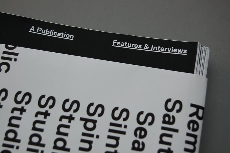

The way the fold opens up to reveal the images is interesting. I touch myself at night


The cover folds out to reveal images of all the featured projects in full colour, this will make up for the black & white images throughout the publication itself. The layout of it this at it's very early stages, I havent' made much consideration to it but it's a start.


Thursday, 26 May 2011
Design Context publicatiioin : Mockup 02
2nd mock up of the publication printed out in black & white. Since the last printed version, I have changed the page numbers numerous times and have now settled on 132 pages + front & back cover.


Tuesday, 24 May 2011
New format!
The design context publication has changed from A4 to 189mmx245mm AKA Crown Quarto on Lulu.com! Made some quick spread layouts with existing content that I had, playing with different column widths and how the type could sit on this format.
The cover definitely needs work to begin with. With the spreads, already I prefer the option of having 2 solid columns of text without it seeming too overwhelming. But more to come when I start placing the actual content in.


The cover definitely needs work to begin with. With the spreads, already I prefer the option of having 2 solid columns of text without it seeming too overwhelming. But more to come when I start placing the actual content in.


Change of format
Having printed out a 2 mockups and being able to flick through and compare the feel of the publication and the how it works with the layout, I'm starting to reconsider the format that I had initially picked. Although the A4 size was good and felt quite nice to begin with, I didn't feel that the layout worked well with it. I was never sure about the narrow columns; they worked well enough when there was alot of copy, but when there wasn't the spreads just looked really empty, making the publication itself seem quite incomplete.

 After some thought on this, and considering the different sizes that are available, I was left with a choice of 4 sizes. The A4 size was what I had printed for the print quality mock up, this felt nice to start with but gradually felt a bit like a text book, especially with the glossy finish on the cover. Due to the image quality sourced from the internet from secondary research, it wasn't wise to make the publication any bigger than A4 as the images would not be suitable for print quality at all, therefore the only option was to downscale. The 2nd option; 194x269 was the scaled down version of the publication from A4 size, printed in black & white for my mockup. Although this was intentional, it feels quite nice, it isn't the familiar A4 size but still has the scale to hold the content together. A5 was too small I think, especially after the bind, there woulnd't be much space to place the images at all, also A5 just seems a bit too standard for a book. Finally I came to the conclusion of using 189mmx245, an option that is available through Lulu! It definitely feels a lot more appropriate for what I'm doing in terms of the layout options and the general feel of it. It's slightly smaller than A4 but wider in ratio. For what I'm doing and the images I have to work with, I think this format is alot more suitable.
SO 189mm x 245 it is!


SO 189mm x 245 it is!
Spread development - filling with content
In the past 2 weeks, I've gradually been receiving the content from the design studios that I have emailed to feature in the publication, so the direction has slowly developed and refined alot more with real content. There has been quite a few changes with the design direction and details of the publication, but at the moment most of it is just adjusting and trying to define a solid direction and identity for it that would run across the whole thing.
Here are some of the more prominent spreads out of the 80; quite a diverse range really all working with the modular grid that's been set. The good thing I'm starting to notice about having so many pages is that I can be more flexible with the layout and have more variations running through the whole thing and it would still look consistent.


Here are some of the more prominent spreads out of the 80; quite a diverse range really all working with the modular grid that's been set. The good thing I'm starting to notice about having so many pages is that I can be more flexible with the layout and have more variations running through the whole thing and it would still look consistent.


Subscribe to:
Posts (Atom)